


During the spooky season, it just felt appropriate to discuss skeletons, loaders, and the challenge UX designers face in making waiting more bearable.
As UX/UI designers, a fundamental aspect of our job is ensuring that a user’s interaction with a product is seamless, enjoyable, and intuitive. However, as much as we try to optimize applications and websites for speed, there will always be moments when users must wait. In these situations, the design’s role isn’t just about aesthetics but also about easing the psychology of waiting.
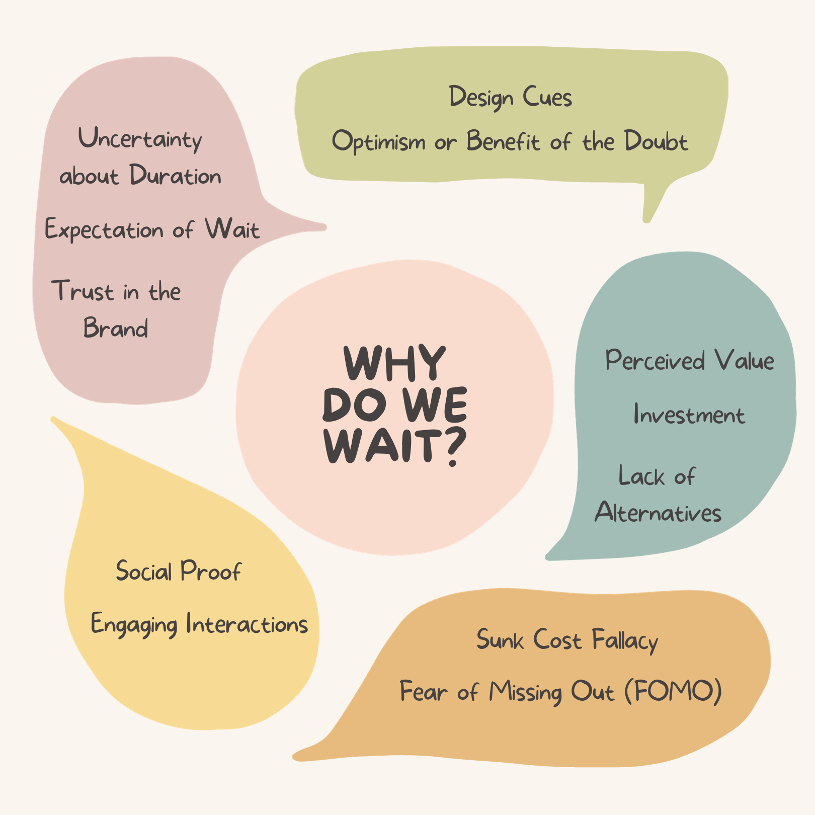
Why do we wait?
Understanding why users choose to wait or feel compelled to do so is a blend of psychology, perceived value, and design cues.
Website load times are paramount in influencing user experience and potential revenue. Research indicates that optimal mobile website load times are 1–2 seconds, with a significant abandonment rate if it exceeds 3 seconds. This is underscored by data showing bounce rates increase exponentially with each added second of load time. Furthermore, faster loading directly correlates to better ad revenues and conversion rates. A majority of consumers expect prompt site responsiveness, and delays can lead to diminished loyalty and a shift to competitors. Industry-wise, average load times vary, but they all underscore the importance of speed. While content relevance remains a primary factor for website ranking, speed has now emerged as a pivotal factor in Google’s algorithm. Optimizing site speed, therefore, is not just beneficial but essential.
At the core, users will wait if they believe the outcome is worth the wait. If a website offers unique content, services, or products that users can’t easily get elsewhere, they’ll be more patient.
Understanding the Psychology of Waiting
Waiting can be frustrating. Whether it’s in line at a grocery store or waiting for a website to load, our brain perceives this idle time as wasted. The psychology behind this stems from our inherent need for immediate gratification. This desire has only grown in the digital age, where information is often available at our fingertips.
But here’s the twist: The actual wait time is less significant than our perception of that time. For instance, a 10-second wait can feel like a minute if you’re simply staring at a blank screen. Conversely, the same duration can fly by if you’re engaged or at least perceive progress.
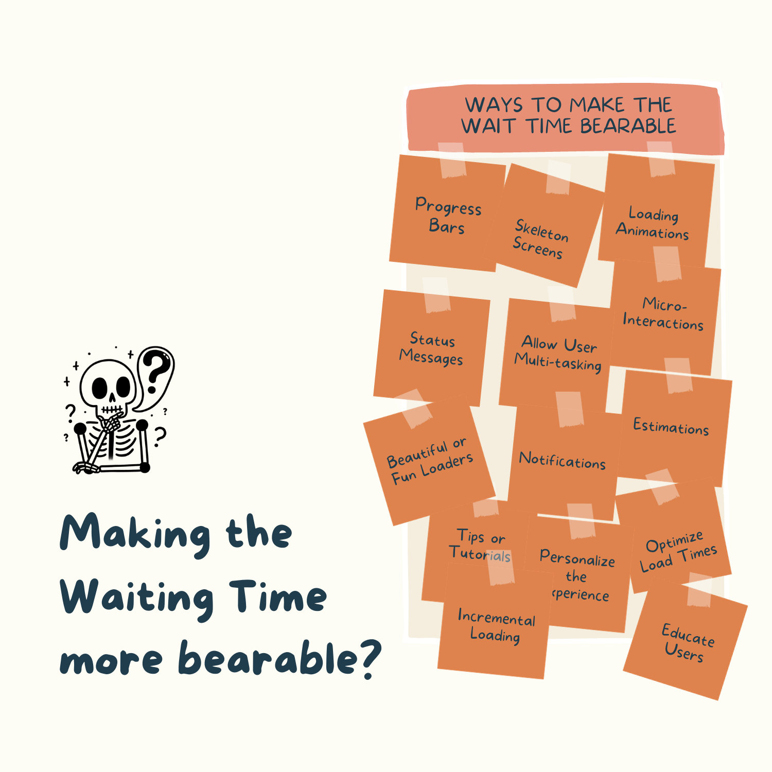
Enter Skeleton Screens
A skeleton screen, also known as a content placeholder, is a version of a blank page into which information is gradually loaded. This creates the impression that things are happening immediately as the user waits for the content to appear.
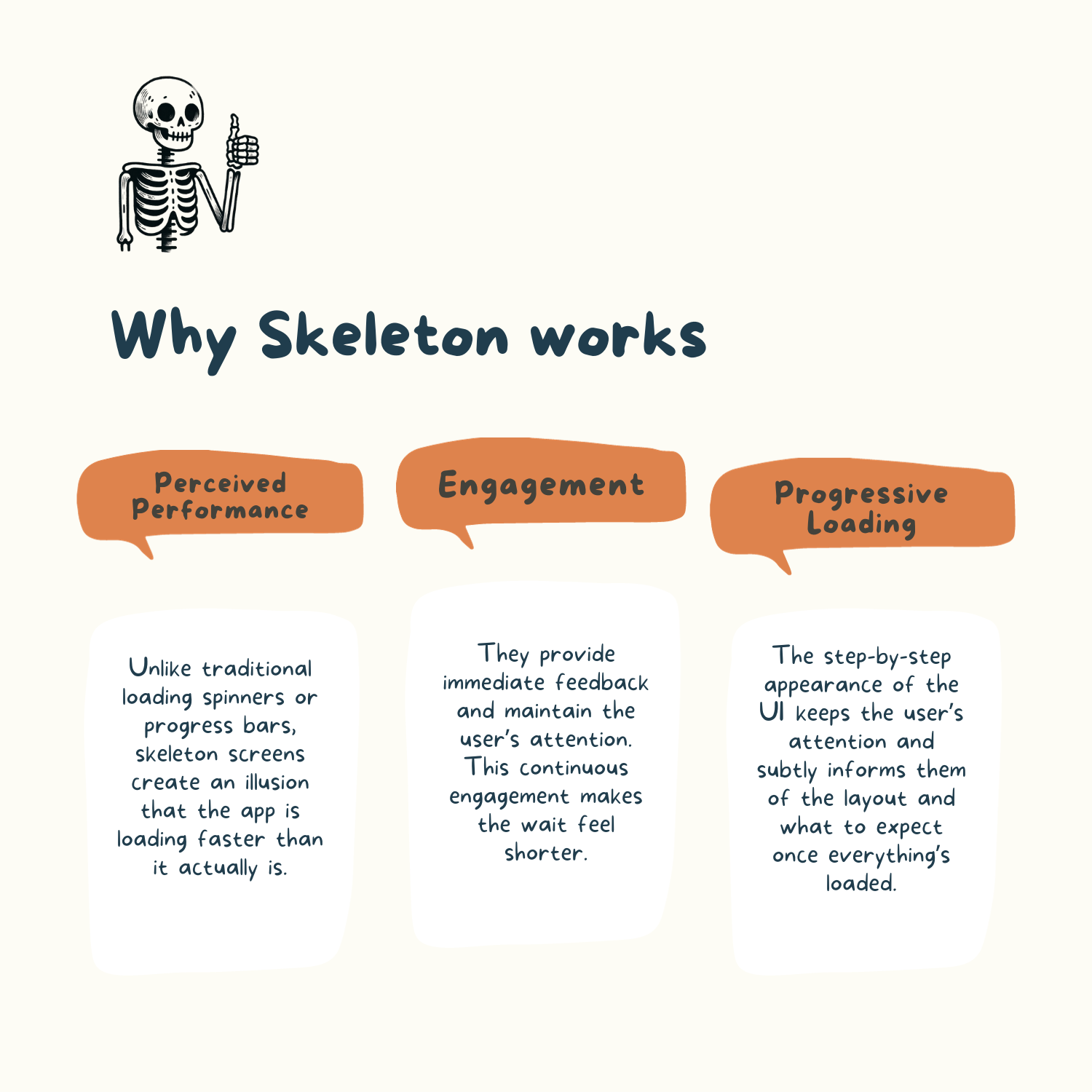
Perceived Performance: Unlike traditional loading spinners or progress bars, skeleton screens create an illusion that the app is loading faster than it actually is.
Engagement: They provide immediate feedback and maintain the user’s attention. This continuous engagement makes the wait feel shorter.
Progressive Loading: The step-by-step appearance of the UI keeps the user’s attention and subtly informs them of the layout and what to expect once everything’s loaded.
Here’s where they can be effectively implemented in various webpage elements:
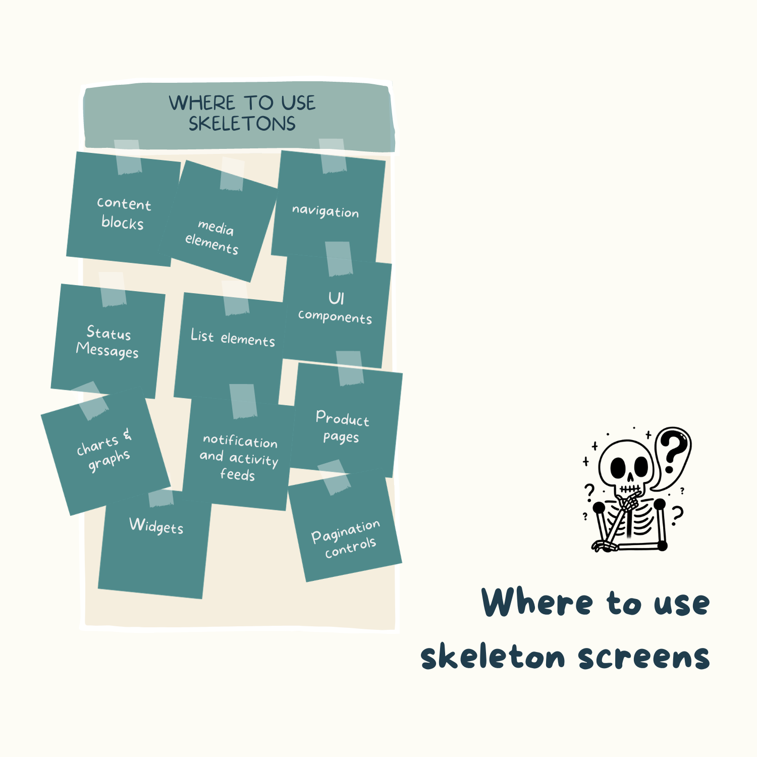
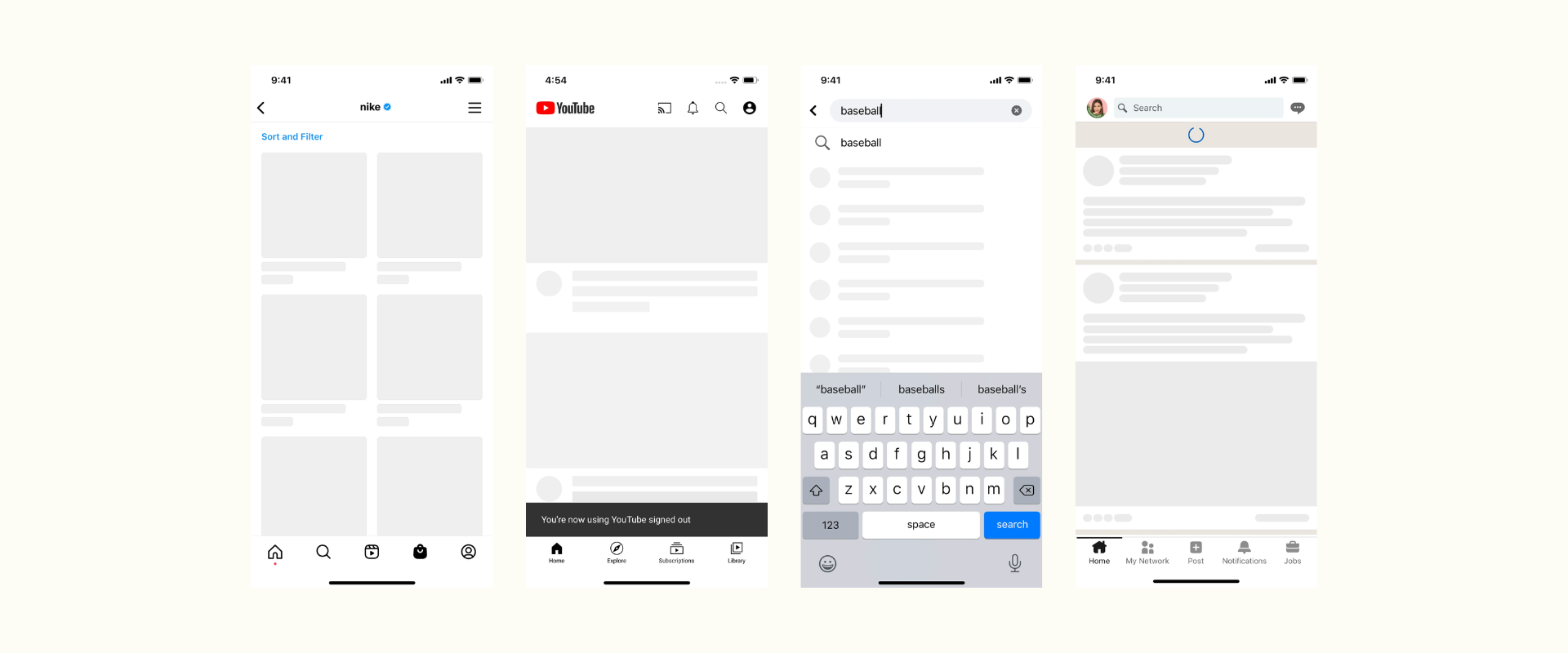
Effective Skeleton screens

Examples of Effective Skeleton Screens
Social Media Feeds: Apps like Facebook and LinkedIn use skeleton screens for their posts. As you scroll, you often see a layout of where profile pictures, text, and images will eventually appear.
E-commerce Platforms: Websites like Amazon, Walmart, Shop app, show skeleton screens of product thumbnails, gradually populating them with images, titles, and prices.
News Websites: Sites such as Quora, Medium, BBC and The New York Times utilize skeleton screens for articles. As the site loads, users see placeholders for images and headline texts.
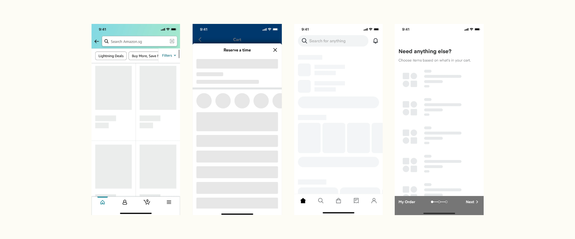
Alternatives to Skeleton Screen
While skeleton screens are an effective tool, they’re not the only option:
Loading Spinners: These are perhaps the most traditional, but they don’t give users an insight into the actual progress.
Progress Bars: A more effective alternative to spinners, as they provide a visual representation of how much longer the user has to wait.
Animated Placeholders: These can be playful and captivating, turning the wait into a more enjoyable experience.
Conclusion
Skeletons, while seemingly simple, play a pivotal role in holding user attention during load times, which ideally should be between 1–2 seconds for mobile sites. As users have grown increasingly impatient with delays, skeleton screens offer a glimpse of the content structure, creating a perception of progress and maintaining user interest. In an era where even minor increases in load times can drastically affect session conversions and loyalty, skeleton screens act as a crucial bridge, ensuring users stay engaged while the content loads. While rich, relevant content is paramount, the importance of a responsive and intuitive interface, complemented by skeleton screens, cannot be overstated. In the fast-paced digital landscape, it’s not just about delivering content swiftly, but also about how elegantly we manage the wait.