


Case Study: Petfood Website design
Project Overview
The product:
Petfood is a newly established organization, whose main goal is to make their clients and their beloved pets happy with their quality products, the main task is to create a clear navigation and the ordering flow for the website.
The problem:
The ordering flow often have too much clutter and confusing checkout processes even for the remaining customers.
The goal:
Design a clear efficient ordering and checkout flow for already existing users.
My role:
UX designer, designing the website responsive designs and ordering flow.
Responsibilities:
Conducting interviews, paper and digital wire framing, low and high fidelity prototyping, conducting usability studies, accounting on accessibility and iterating on design.
Project duration:
January, 2022

Petfood is a local retail focusing on delivery of the quality products throughout the whole country. They want to design a user-friendly ordering flow for their remaining customers.
I’ve conducted the interviews and empathy maps to understand their users and what specific challenges or difficulties they face while ordering from Petfood. Majority of users were working adults who have no time to go to different stores to buy products for their pets, another group found themselves frustrated with placing the order and in the end they give up altogether.
Pain Points:
1. Time - Working adults are too busy to visit or call the shops to place an order.
2. Navigation - Sizes of buttons on shopping websites and confusing filtering sometimes lead users to make mistakes or drop the order.
3. Delivery - Confusing delivery method, users are not sure about their order delivery status which creates a confusing state.
4. IA and experience - Text heavy menus are often difficult to follow and order from, sometimes websites don’t provide engaging browsing experience.
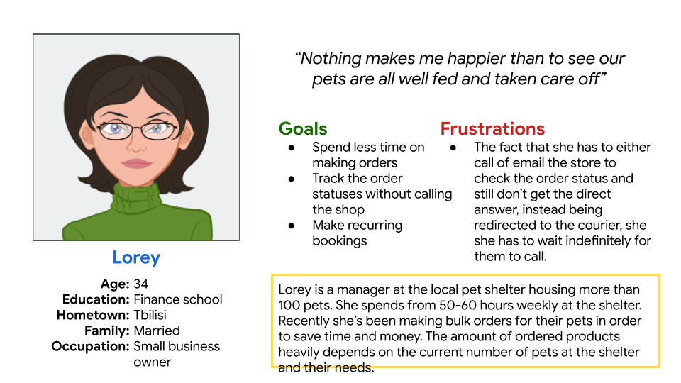
Persona - Lorey is a busy professional and pet shelter owner who needs to be able to bulk order and track the order status because they don’t want to call the store or courier all the time when they want to check their order.
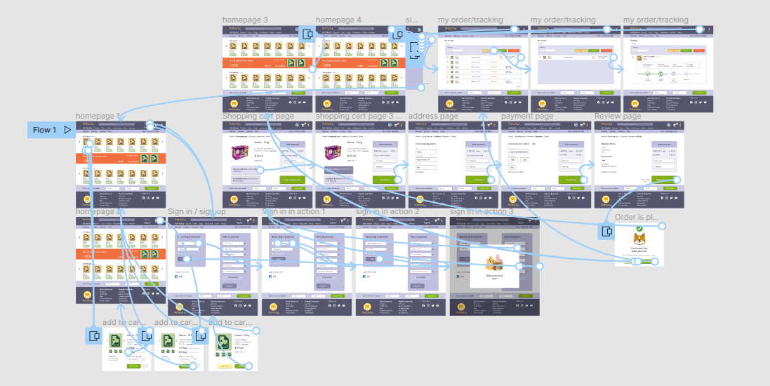
User Journey maps
I've created user journey map of Lorey's experience to help identify possible pain points and improvement opportunities

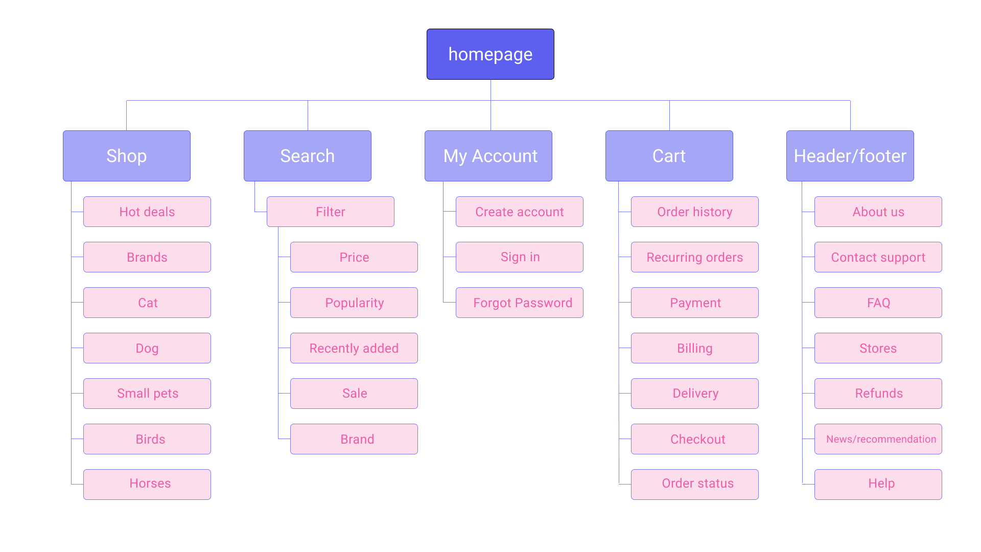
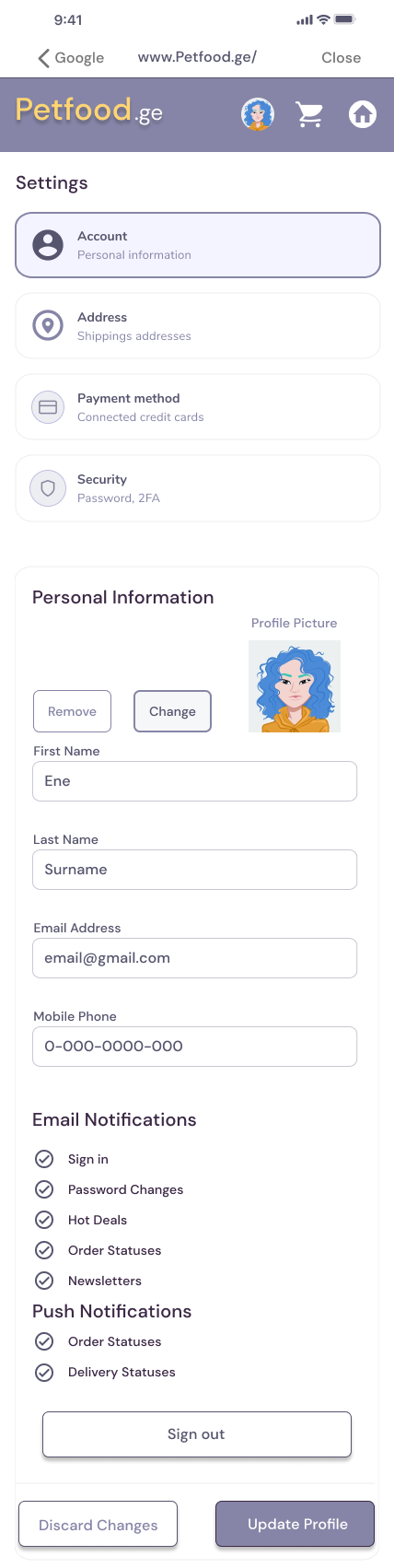
Sitemap - The research revealed a lot of different fields to improve, first was to make simple, familiar yet effective sitemap, which will be helpful for the users to navigate through the website.
Wireframes - I took my time to play around on each screen size, to make sure that responsive designs meet user requirements.
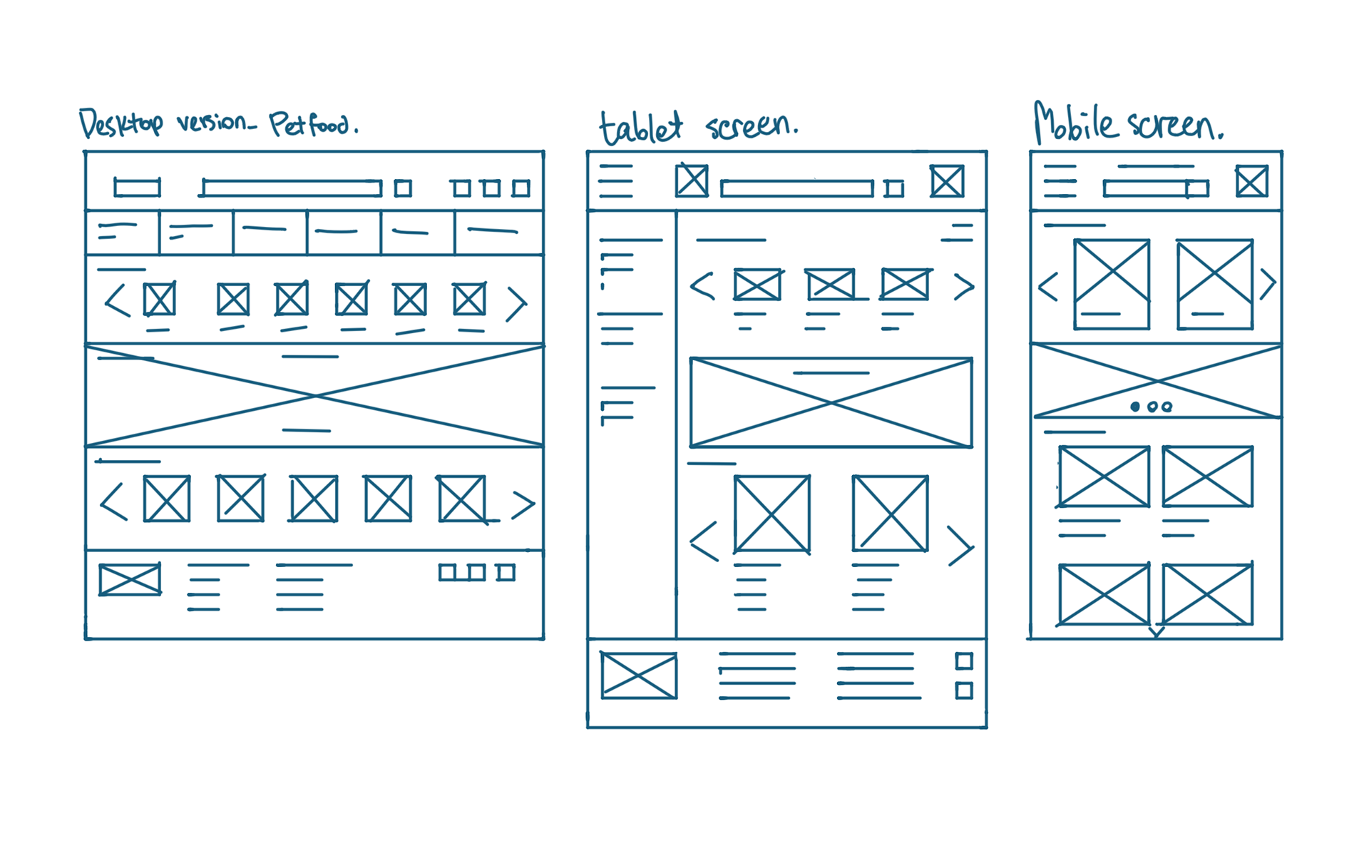
The layout I’ve chosen is mix of box layout and tiered layer cake layout, for the tablet is mix of Z and F shape layouts.
For the mobile screen I decided to stick with two column, grid of card layout mixed with e-commerce typical layout.
Digital Wireframes - Main idea of this design is to make everything easily accessible for the user. on the homepage, I emphasized on easy navigation menu, search bar on familiar place and special offers in the middle.
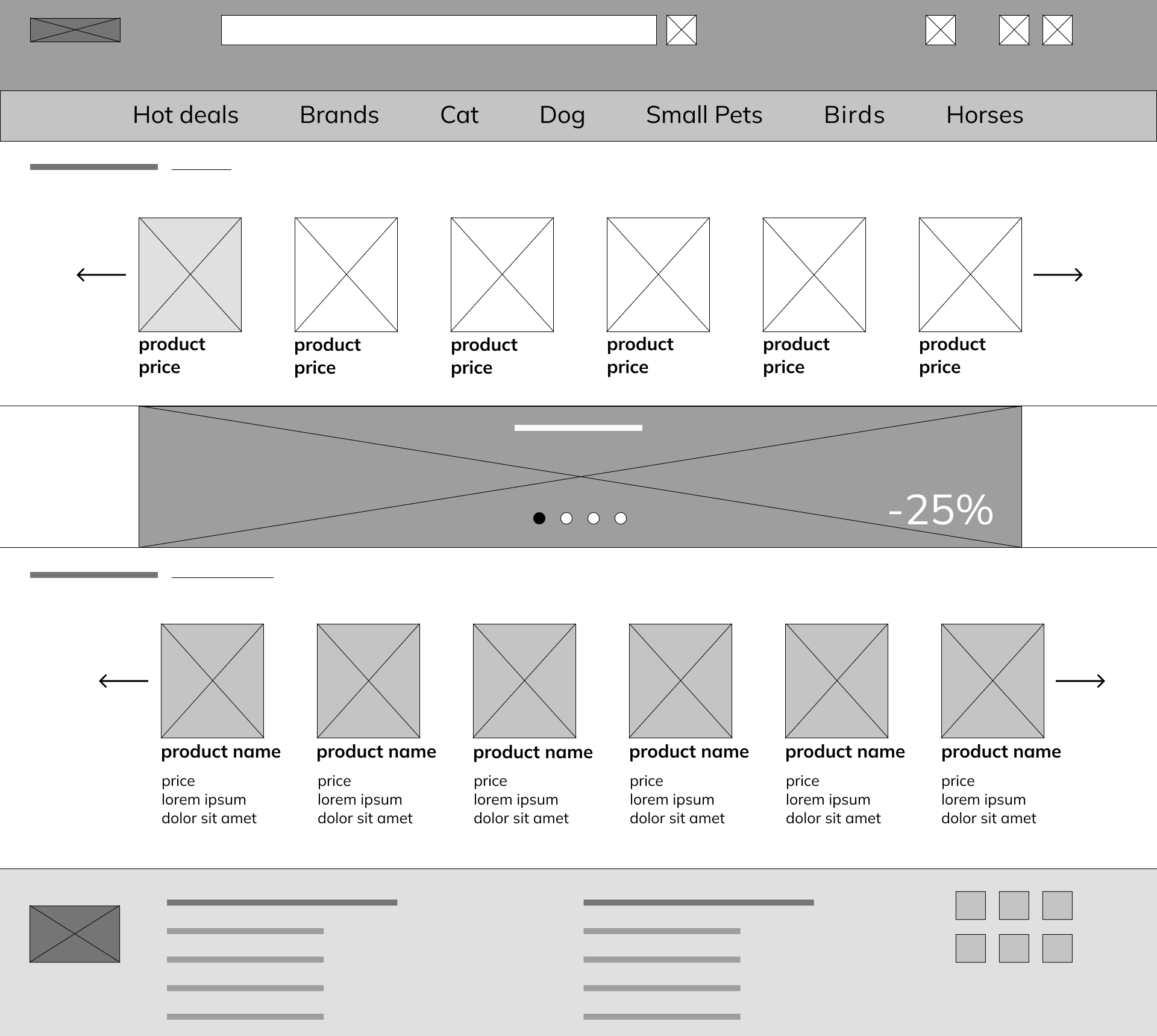
Navigation menu, for easy access
Search bar on top of the website.
Special offers in the middle, so users won’t miss it.
For the mobile website homepage, I had to change horizontal navigation menu into hamburger menu, to save place. Some of the most popular and important sections will be places in front as well.

For the mobile website homepage, I had to change horizontal navigation menu into hamburger menu, to save place. Some of the most popular and important sections will be places in front as well.
Usability study findings
In order to start testing the designs, I've created a lo-fi prototype, check below. This prototype was used in unmoderated study with 5 participants (18-70 ages). Here are the main findings:
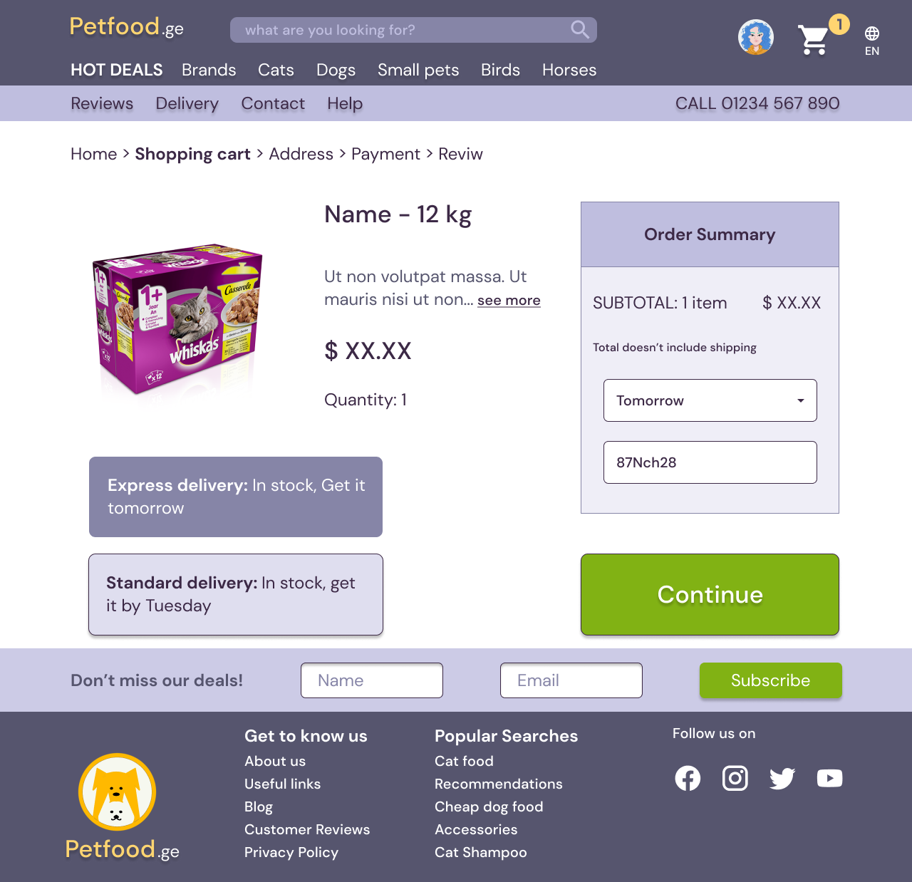
1. Shopping basket and continue shopping option - once at the checkout screen users wanted to have option to easily change the amount of items or continue buying different items without losing the previous ones.
2. Autosave - for easy, straightforward checkout flow, users preferred to have saved card info on their profile.
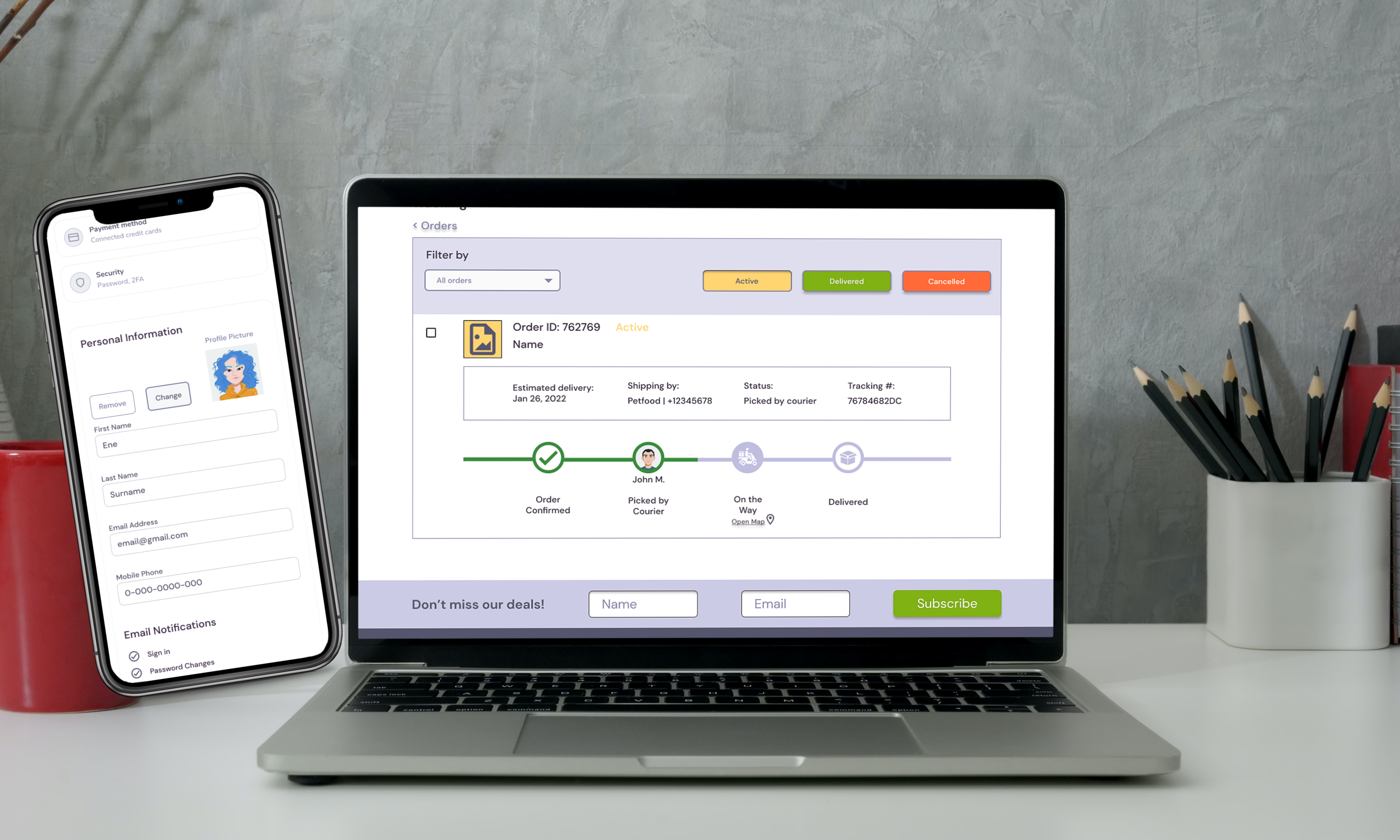
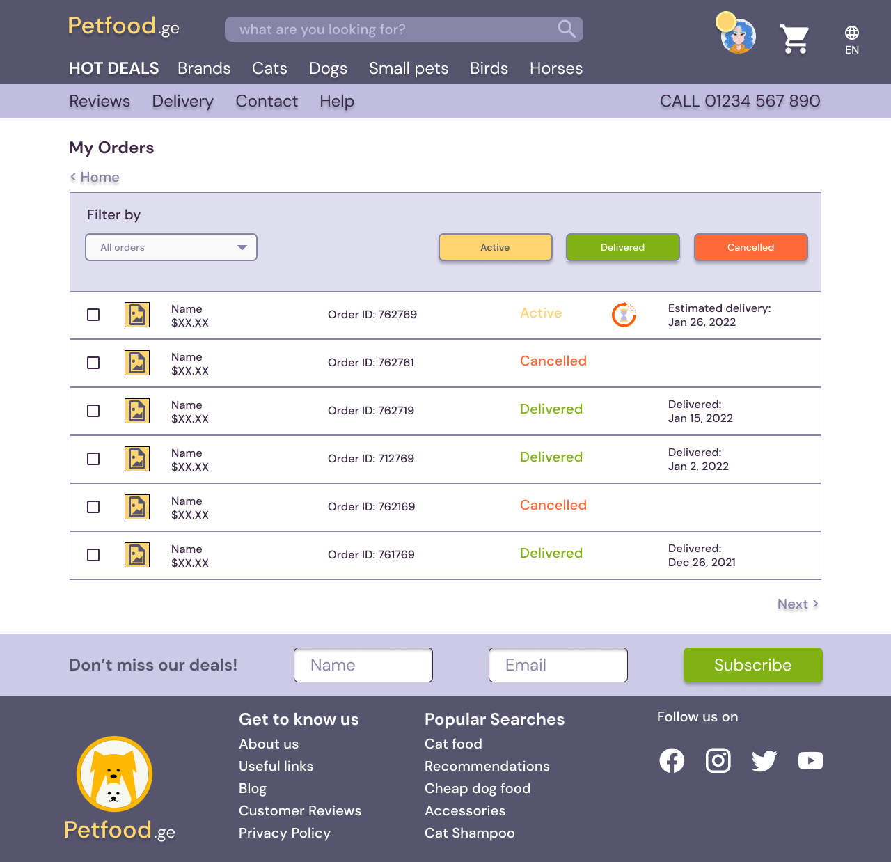
3. live-tracking the order - we found out that majority of the participants felt the need to live-track their orders.
Mockups
Sticker sheets.
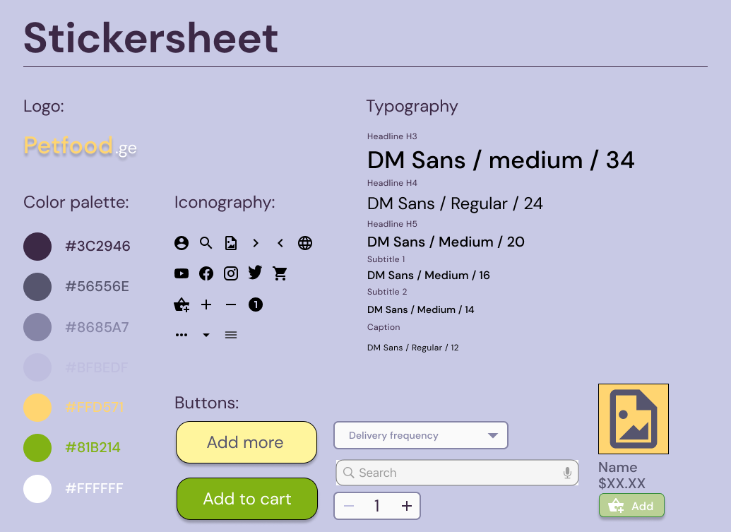
Based on the insights from previous usability study, we made some changes to improve the flow.

Accessibility considerations
Typography - we used different sized text for clear visual hierarchy on the webpage
landmarks - using landmarks help users easily navigate the side, especially those who use assistive technologies,
Going Forward
Impact
The target user shared that the design was easy to use and the flow was straightforward, where visual hierarchy played a big role.
What I've learned - I learned that small details matter a lot, in order to have smooth experience, whether it's a checkout flow or order-tracking, you need to consider the simplest ways to make sure that users are able to complete the task without any minor inconveniences.
Next steps:
1. Conduct another wave of usability testing.
2. Ideate and iterate more on design