

CASE STUDY: DESIGN A CARD SPENT HISTORY FOR A BANK APP (part 2 UI)
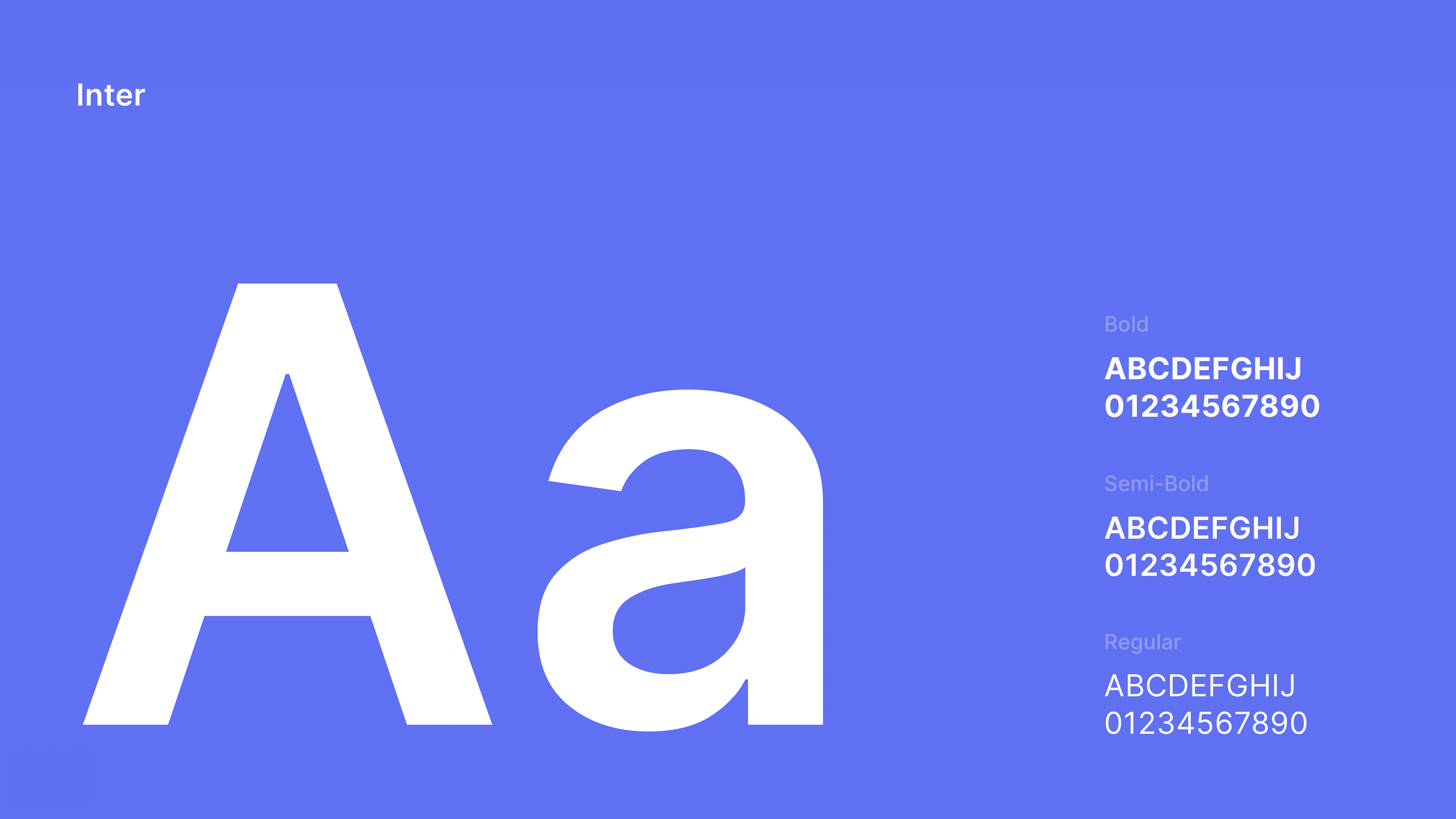
We prefer using Inter font. It is optimized for digital interfaces, additionally, its open-source nature allows for easy implementation across various platforms and its legibility ensures that important information is easily readable on different screens. The font's clean and modern aesthetic also helps create a sense of trust and reliability for the user. Inter offers a wide range of weights, allowing for flexibility in design and consistency throughout the interface. In this case, we chose to use Bold and Semi-Bold for Headlines and subtitles, and Regular for body text.
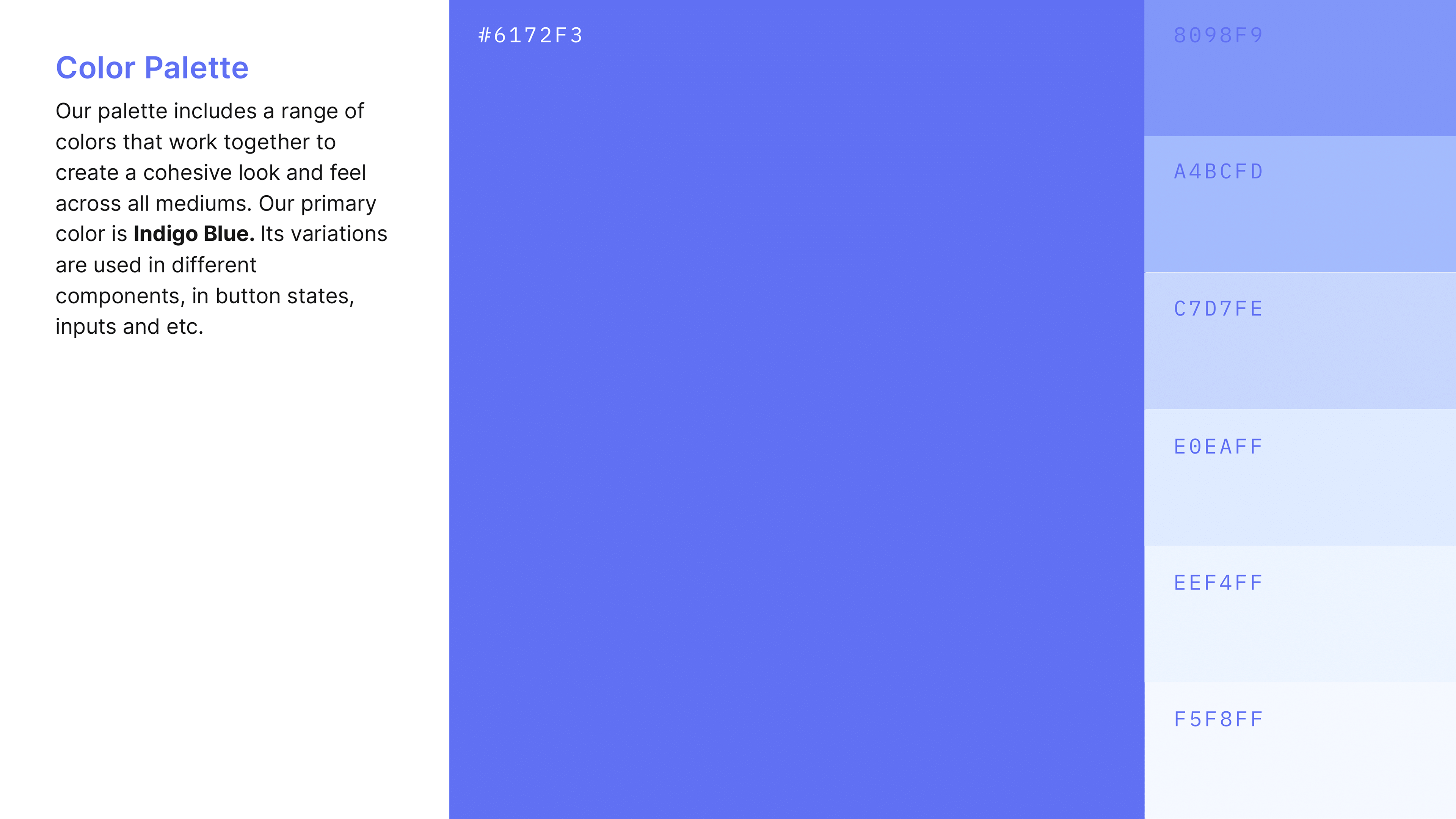
Our palette includes a range of colors that work together to create a cohesive look and feel across all mediums. Our primary color is Indigo Blue. Its variations are used in different components, in button states, inputs and etc.
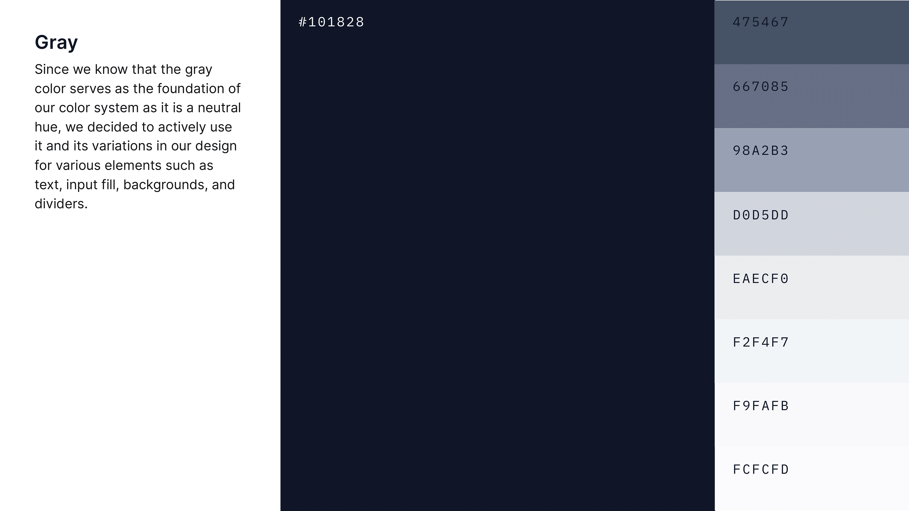
Gray, as a neutral color, is an ideal choice for use in Interface. It serves as the foundation of the color system, providing a sense of balance and stability. Gray is a versatile color that can be used for various elements in the interface, we decided to use it in our components such as text, input fields, backgrounds, and dividers. The neutrality of gray allows it to blend seamlessly with other colors, making it easy to create a cohesive look and feel throughout the design.
Additionally, another reason why gray is a better choice than pure black for text is that it is more legible. Black text on a white background can be harsh and can cause eye strain, especially when viewed on screens. Gray text, on the other hand, is more subtle and easier on the eyes.
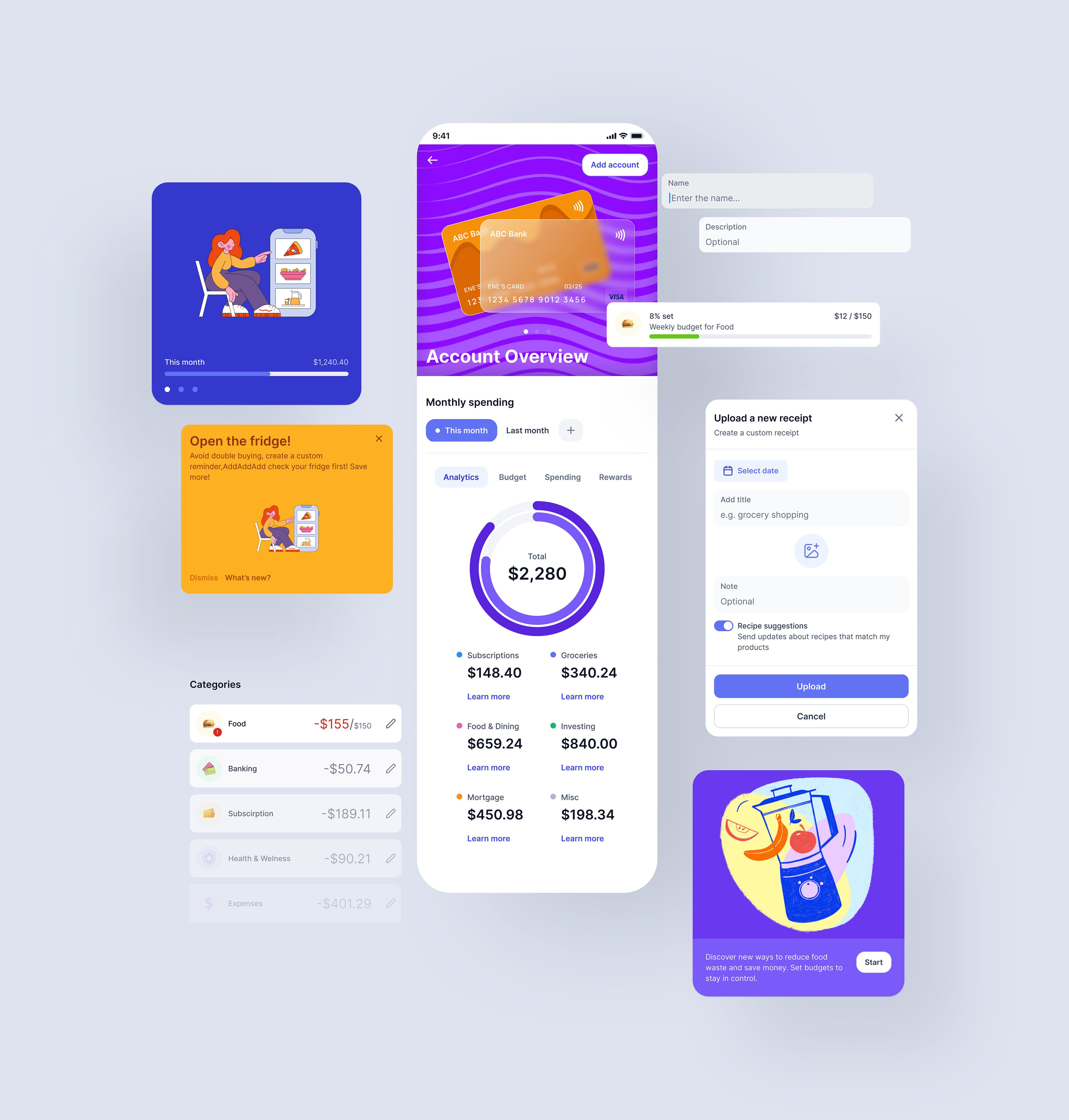
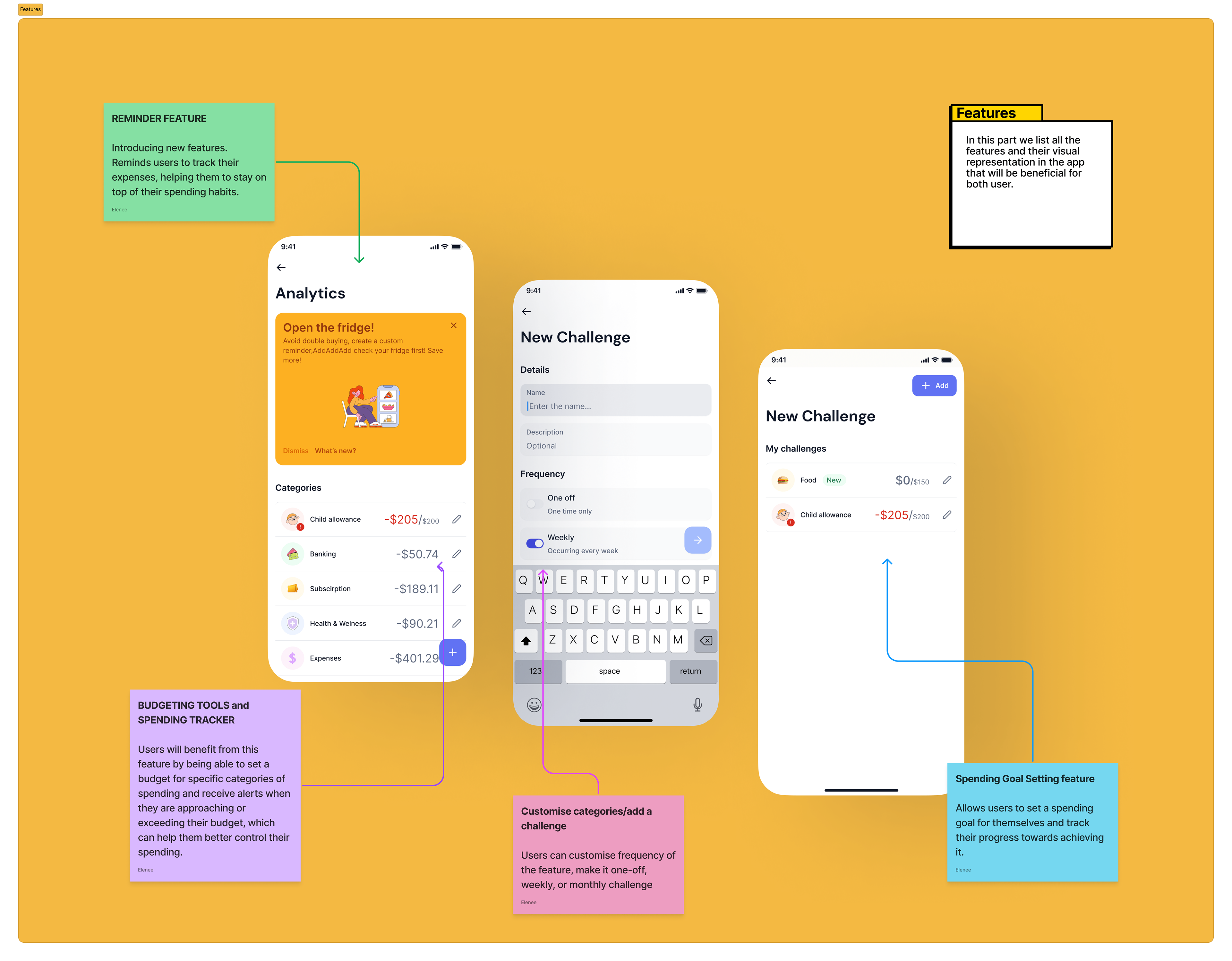
1. Receipt upload
2. Reminders
3. Categories