

How I use my Clip Studio Paint on Galaxy Tab S7: Workspace, brushes, color palette and some tips
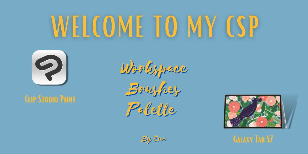
Welcome to my Clip Studio Paint Workspace! Sharing is caring, so I’ve decided to open my chamber of sec-, I mean open my Clip Studio Paint and share the brushes I use daily, color palettes and some tips that you might find helpful.
Introduction
For those, who aren’t familiar with CSP, it’s a versatile digital drawing program, that comes with lots of useful features for single or multi-paged projects. Currently they offer two versions PRO(affordable, great for single page comics and illustrations) and EX(plus extra features that are useful for creating multi-page projects.
One of the main reasons why I love using this program is their community and assets library. Imagine thousands of artists all around the world coming together on the platform, sharing their tips, tools, creating new ones and just, helping each other. You can find these amazing tools and features for free and some limited ones that you can purchase with Clip Studio Coins.
It feels like I am preparing for a house tour, but before we go to the main part of this article, let’s start from the device and the workspace. Currently I am using Samsung Galaxy Tab S7 (11 inch, 2560 x 1600 resolution) and CSP Pro version.
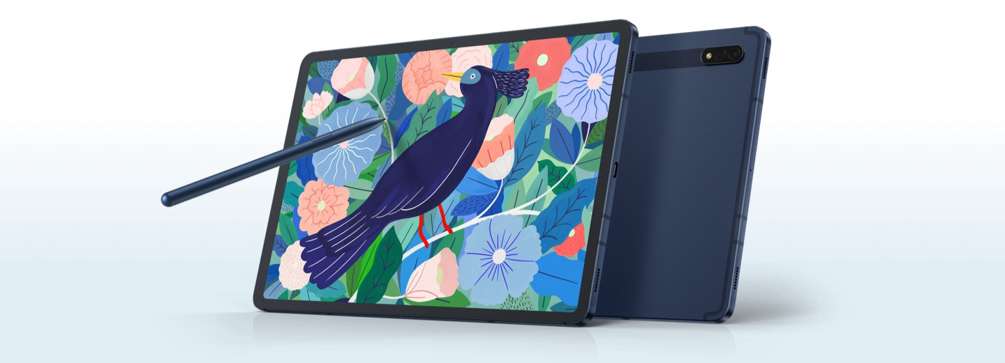
About a year ago I realized that I was more comfortable working on small screens so instead of buying a big monitor and a drawing tablet, I decided to choose between Galaxy tablets and iPads. The biggest challenge I had when I switched on different device was adjusting workspace.
Workspace
Palette layouts, shortcut settings, command bar layouts and preferences for unit settings together create workspace and Clip Studio Paint allows you to customize and personalize your workspace according to your needs.
You can even find someone else’s workspace and download from assets library or create your own multiple ones for different dimensions and devices if you tend to switch from one device to another.
Since I don’t use more than one device and I don’t like using many features daily basis, I try to keep my workspace as minimalistic as possible. As you can see, I divide my screen into tow parts, 1/3 is taken by the tools and I use my left hand to switch between them but you can use keyboard shortcuts as well. The rest of the space is for the canvas.
Having a personalized, organized workspace increases your productivity, helps you draw quickly and efficiently.
My advice would be, if you’re new to CSP instead of dive straight into drawing, take couple of hours, even couple of days and play around with tools and sub-tools until you find the layout that works for you the best.
When it comes to choose the canvas’ size, I don’t really have any tips, the dialogue box is pretty straightforward when you open a new file:
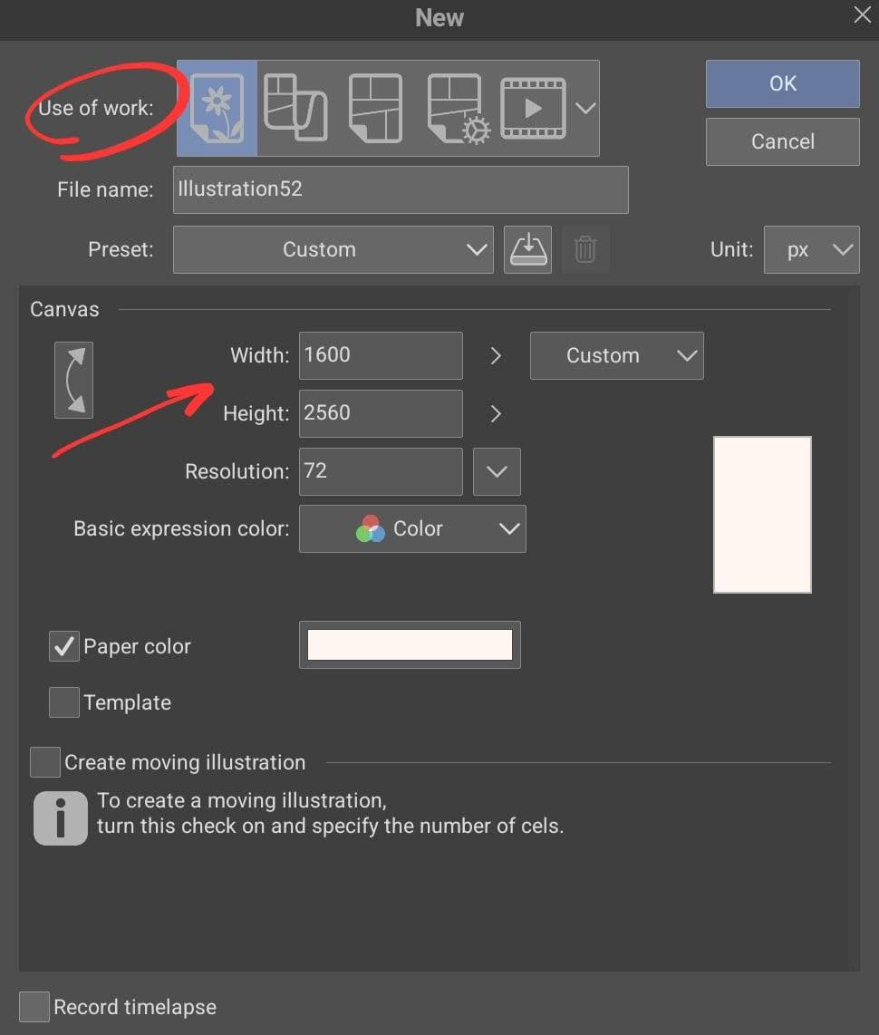
If you’re looking for some extra info about the different type of files, this article will help you. My tip would be just go with the automatic suggestion or if you’re setting don’t go any lower than 2000 px long and 1200 px wide. As for the paper color, depends what you’re drawing, but I rarely set my canvas white, I think, it’s more like a personal preference, but my canvas almost always have a slight rosy hue.
Tools and Sub-tools
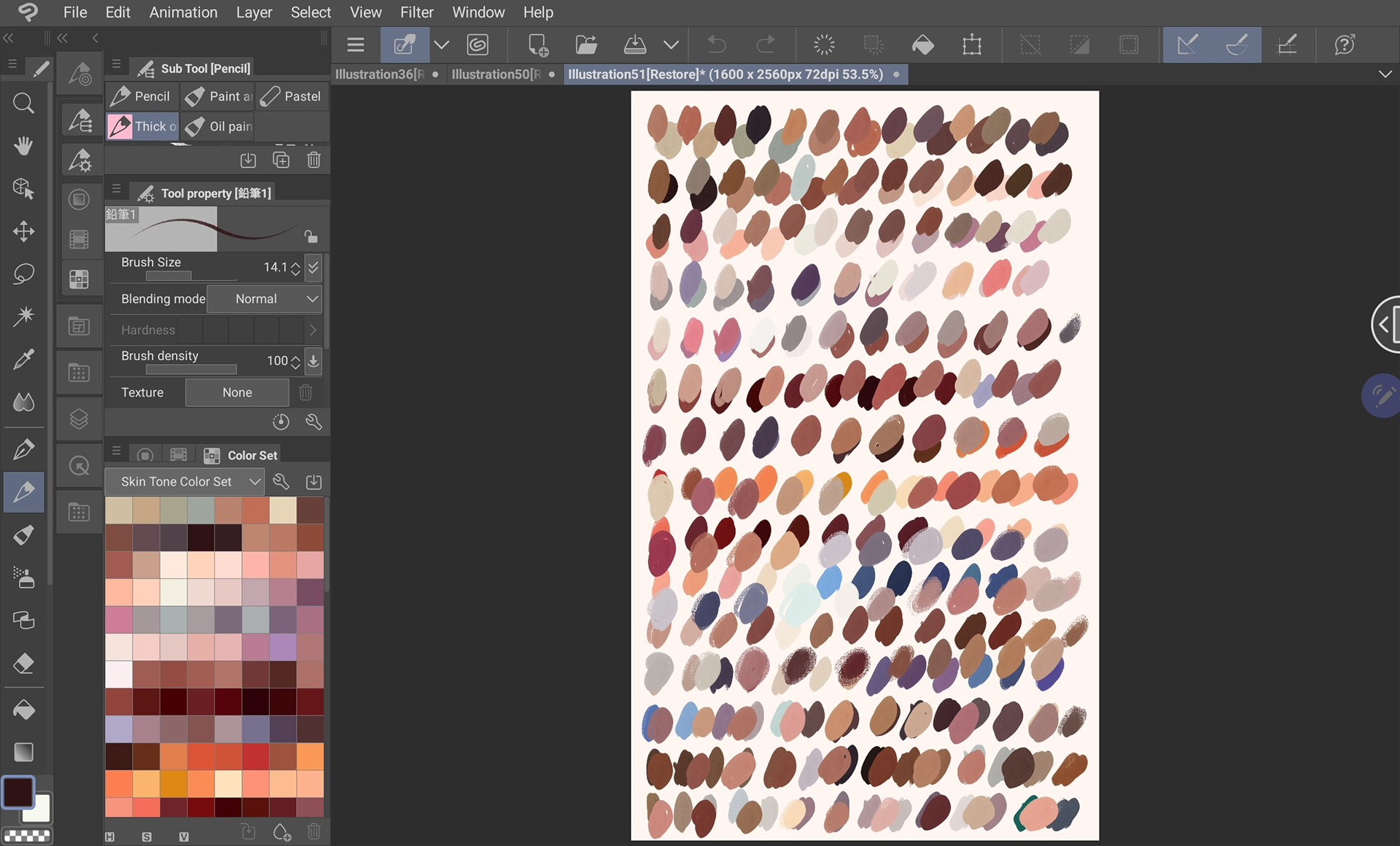
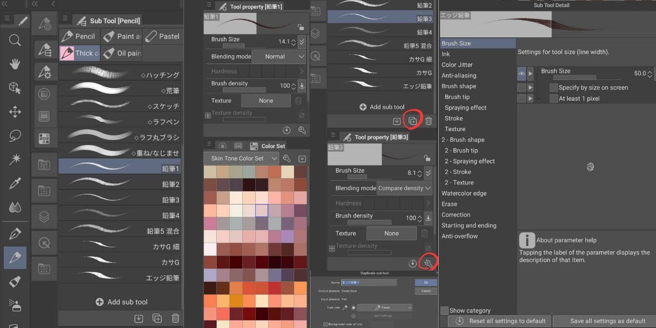
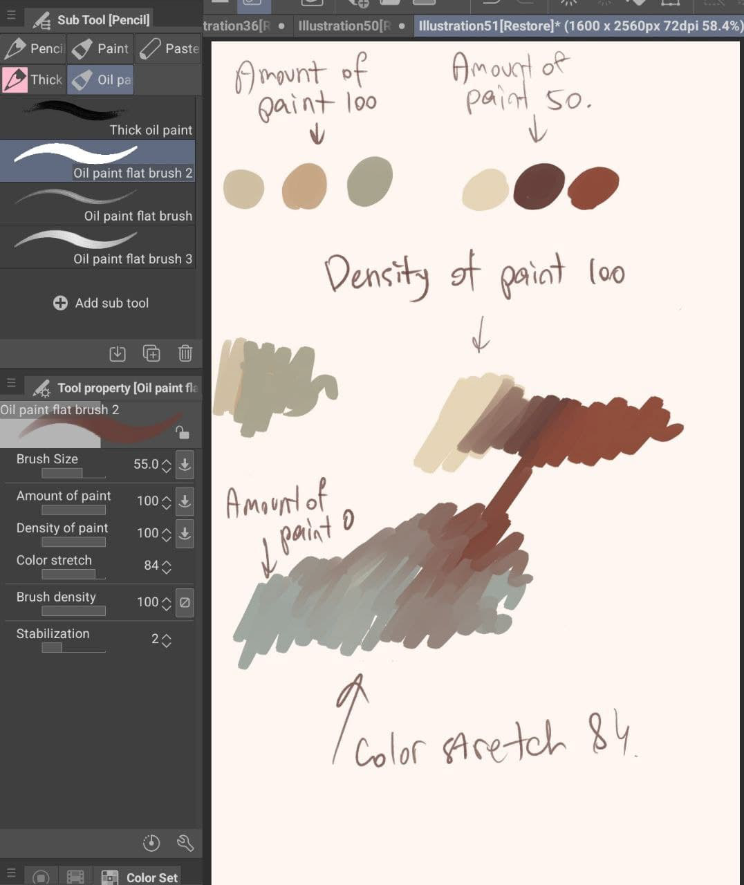
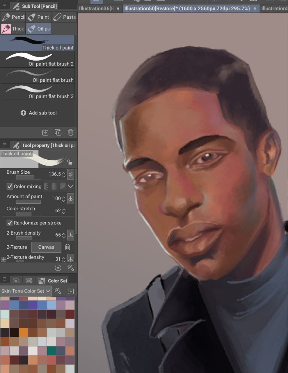
My tool palette is placed at far left side, in the middle I placed the most often used tools: brushes, pens, pencils, airbrushes and etc, because that where I my thumb is placed generally and switching gets easier. I really suggest using Ruler tool if you haven’t started yet, symmetrical ruler has saved my life couple of times. Instead of placing size property under brush tool, I have Tool property, which helps me to control my brushes, not only change their size but their opacity, stabilization and etc, if you want to have better control and make your brushes more flexible, I suggest you make this tool visible instead of hiding it. When it comes to creating a new brush, Imagine you found a nice brush but something just doesn’t feel right, you can simply duplicate the current brush use settings tool icon to open the details and change the brush tip or strokes and etc. (see the image above).
A never ending quest for the perfect brush
Be honest, how many hours you’ve spent to find the perfect brush? Some of us even purchased expensive tool set just to find out that apparently they don’t work as we thought they would work for us.
Because sometimes what we search for is a technique not a brush, brush is a simple tool you can modify whenever you want to suit your needs.
Therefore constantly searching for a single powerful brush will just slower your work and affect your productivity. I always remember what my art teacher used to say, which now that I think about it was her attempt to justify the lack of brushes at school, but it still taught me a very valuable lesson:
Limiting your choices in tools will help your creative mind to grow and brush is a tool, and the fewer number of tools you have, the better you will learn how to use them in different situations.
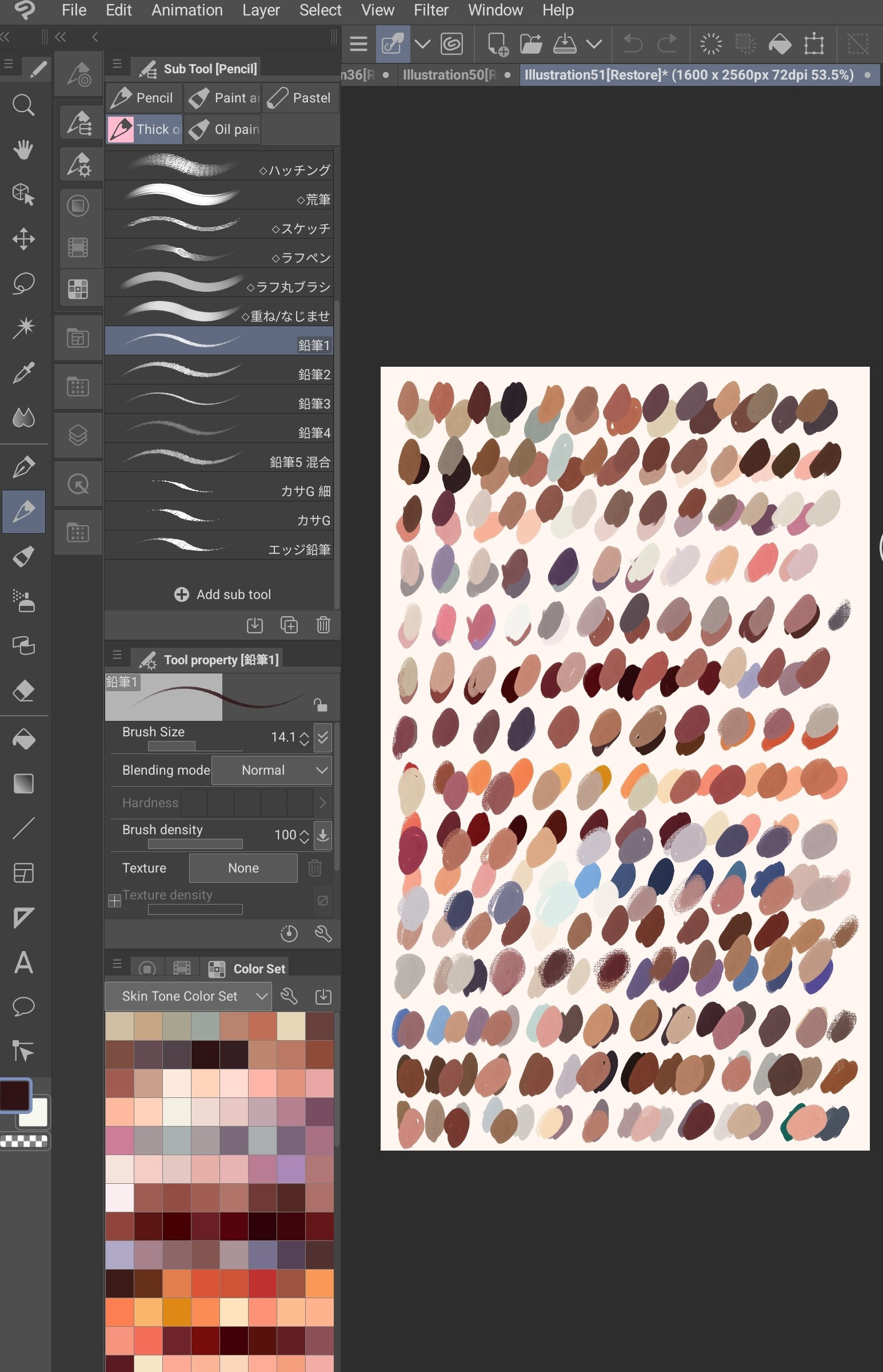
Right below the Tool property, I place my color palette, I use three sets, color wheel/triangle, recently used colors and customized color sets. You can make your own set or import from the asset’s library. If you want to insert new colors and you have RGB/HSV/CMYK go to Window > Color Slider, this will change your wheel into slider where you can manually insert the colors. If you’re studying colors and using references, nature photos, people, or buildings… I suggest you use color picker tool, and make a Color Set out of these colors and save them, it will come handy.
Let’s break down brushes in CSP, whenever I am choosing a brush or creating, what I pay the most attention is it’s tip (how brush tip change with pen tilt and direction) first of all, Ink (how the brush behaves on the layer) and texture. According to this I can modify them however I want and give them the shape I want.
But this doesn’t mean you don’t have to make your own research, just be prepared that sometimes your quest will end without killing a dragon.
Top 5 brushes I use daily
I am one of those artists who have large variety of brushes but only use handful of them. With CSP what I draw generally are portraits, even though I love going through new brushes in assets library, I still stick with my favorite ones.
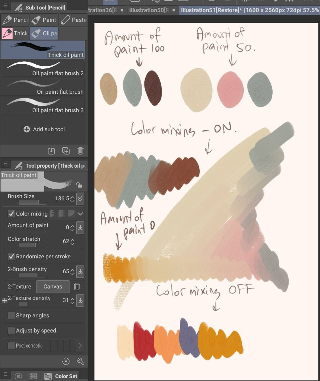
1. Thick oil Paint — this brush comes with the CSP, perfect option for people who are familiar with using oils and acrylic paints.
2. Flat oil brush 2 — the brush comes with the CSP, but I have at least 3–4 modified versions, I changed tips and strokes. great for lines and with 0 color you can even use as a blending brush. I do, works perfectly!
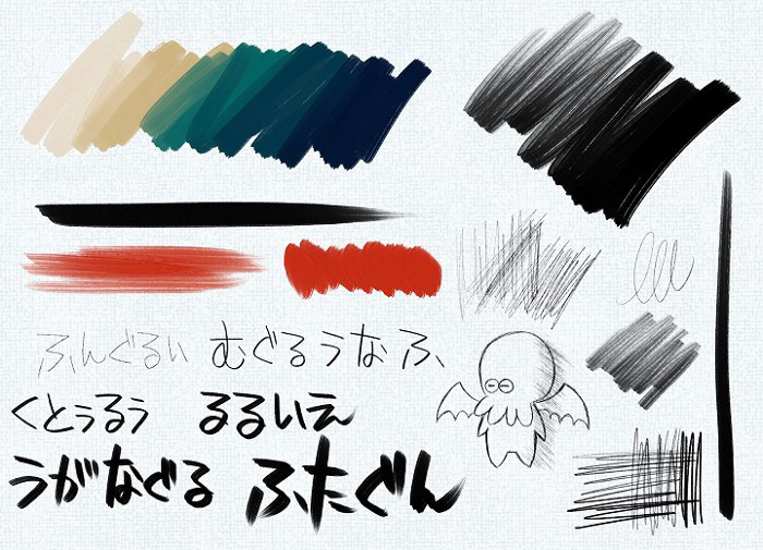
3.Pencil brushes (鉛筆ブラシ) — Definitely one of the best brush sets I’ve come across in the library, what I do sometimes is that I use the first brush in the set for sketching and then I use oils on the same layers for filling.
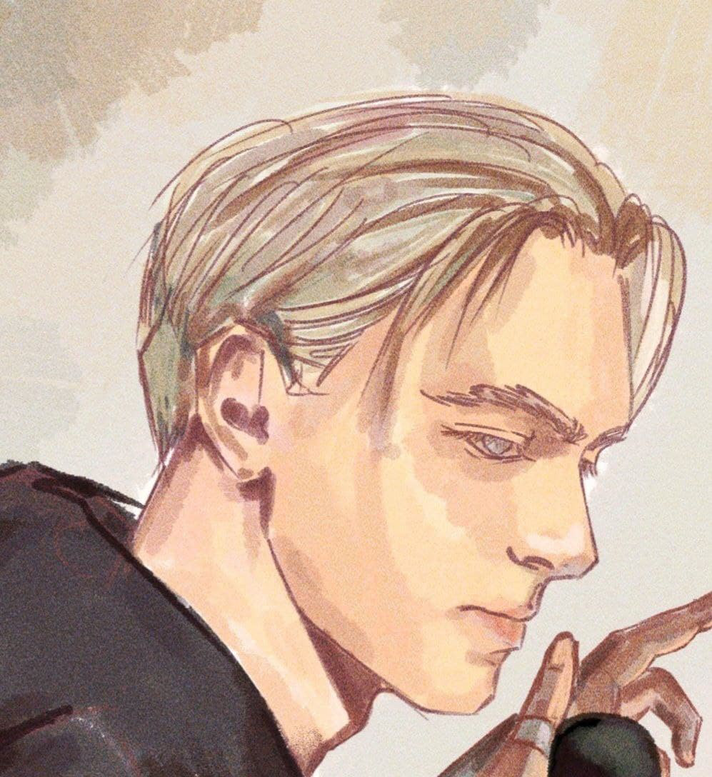
4. Zassara Paintbrush Oil Wind (ザッサラ絵筆油彩風) — You will fall for the texture and the feeling of this brush, I use it for hair mainly, good for sketching too.
My most used color set and some tips that might help you for skin tones
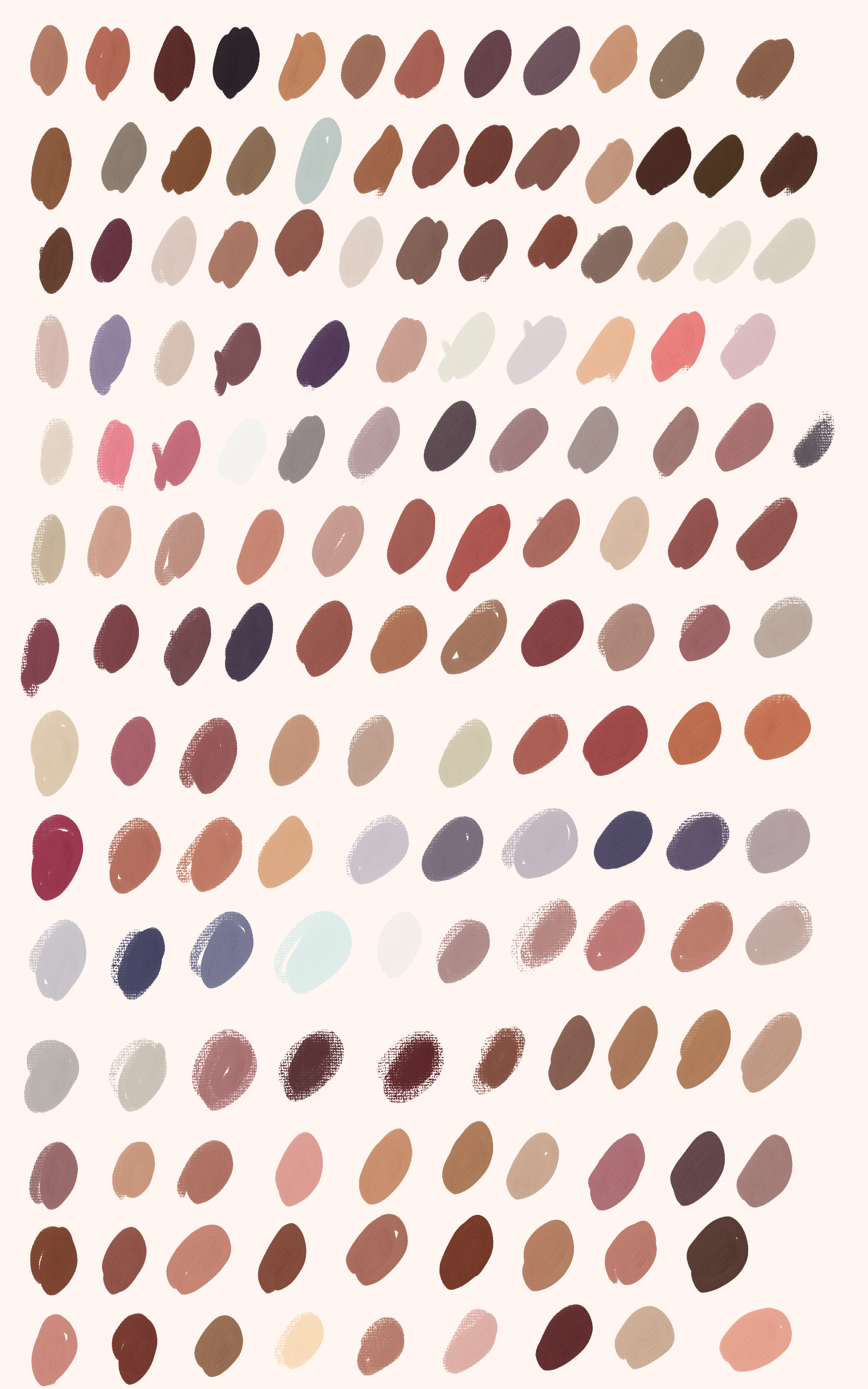
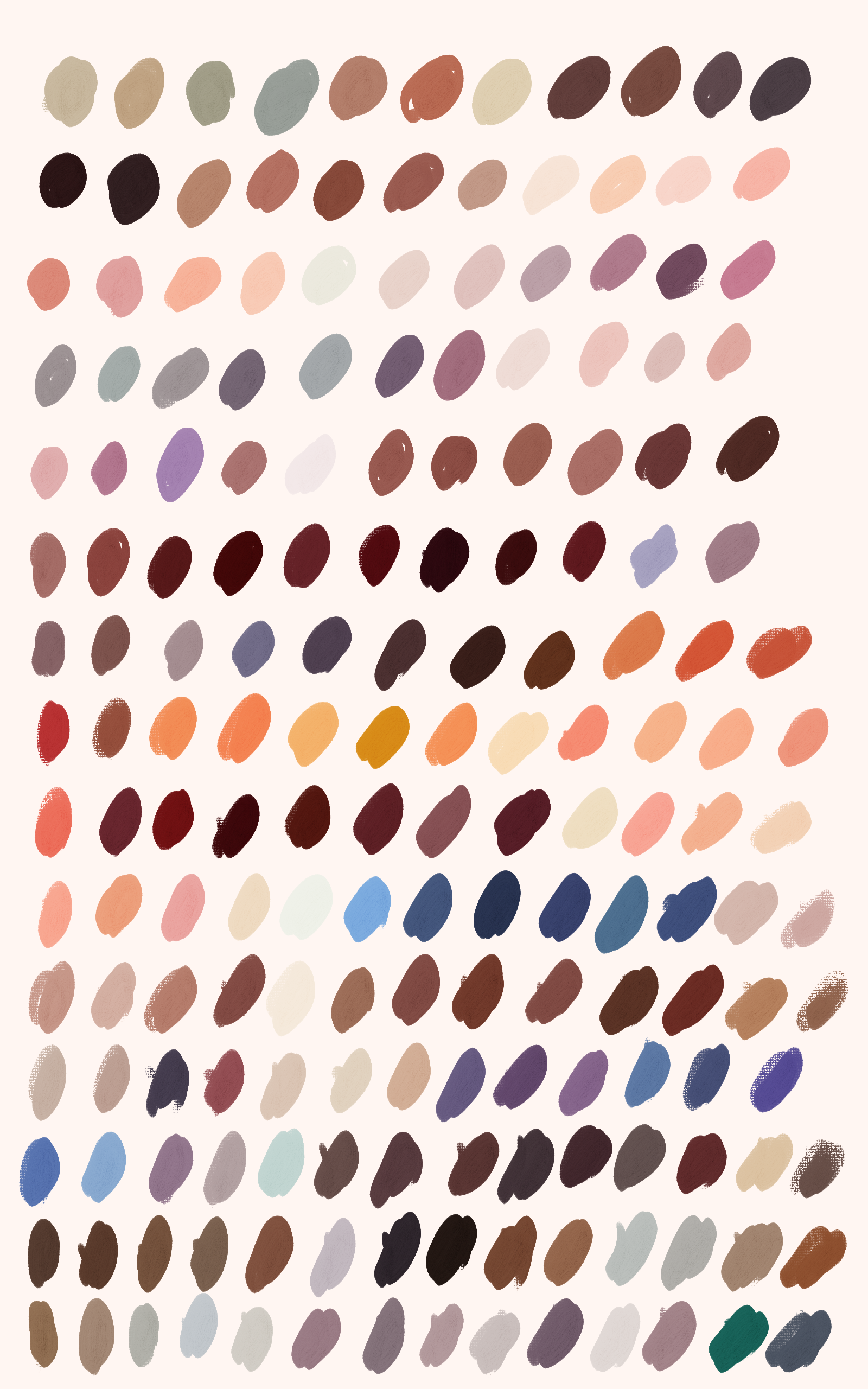
Remember when I mentioned about the assets library? Well, this is the time when you should open it and download this amazing and underrated skin color set from the user DimitriBlaiddyd. The skin color and palette depends on the environment where the object currently is, but this set offers you shades applicable in different lightning.
60:30:10 ratio — I am sure you’re familiar with this classic ratio, at least subconsciously you know what it means, remember the bathroom décor at home or the app you’ve visited earlier, 60:30:10 is a décor rule that helps create a color palette for a space, where primary color takes 60% of the entire space, whereas 30% and 10% are left for the secondary and accent color respectively. I would suggest to take this simple rule and use while drawing or shading skin tones, trust me it will work!
Thoughts about skin tones and highlights
I want to address some mistakes that we meet when it comes to skin tones, first of all skin tones aren’t boring, forget about single pinkish, yellowish or dark red tones, to check how versatile our tones are, simply check with color picker programs, upload photos and it will blow your mind. Of course, once again, it depends the environment the object is, but it’s still refreshing to know that you’re unlimited when it comes to skin. The biggest mistake we make when it comes to darker skin tones is that we assume or think that you can create dark skin by creating white skin tones and just make them dark. Don’t be afraid to add colorful hues, strong highlights — blue, green, yellow, orange on the areas of forehead, nose, ears and chin. You can include or sneak background colors into your shadows, it will increase your shape values and give more natural look to your painting.
Some blending and correction tips
It’s weird I know, but all you need to do is play with Opacity and Size and you’re done. Mainly what I do when I have to blend, I use the same brush but without color, fixed opacity and size. You can find a blending tool in your tool menu but I’m not really fan of it. Sure, you can use it, but I would suggest to modify it first and then use it. CSP now has Liquify tool, but I would lie if I say I’ve ever really used it.
Using this tool, you can do things like make an eye larger, adjust the line of a character’s chin, make a character’s hand smaller, or create a swirly special effect for a magic spell. — LizStaley
Layers
I am not a sadist but I like working with only limited number of layers, I would side myself with the artists who like to use shapes instead of lines, lines might be confusing sometimes, but shapes never lie. I sketch on one layer and make another one underneath for color, I choose the sketching brush color according to what I want to draw, mainly I use colors from dark red area. I apply base colors on that layer and once I get the idea how the final piece should look, I merge my sketch layer and color layer and continue working on one layer. My portrait building flow is next: shape of head > find the pattern > start with nose > fill with colors > draw with the nose in your mind > use the same brush but with no color to shape the eyes and mouth > apply highlights to tip of nose, forehead, cheeks and chin, jaw line.
Extra tip
I love adding noise texture to my paintings, I know it’s more like a personal preference, but if you want to have one, use this TV Noise (TV 노이즈), highly recommended.
Conclusion
Oh, wow, it was a loooooooong post. I really tried my best to include all those small
details that make my drawing experience easier on Tab and sneak some tips along. As I am writing this and me eyes are popping out, I know I may be forgetting some stuff but I plan to break down this article and provide more info about each content. At the end of the day, we still stick to what works best for us, but if these tips help you somehow, I will be happy!