


Case Study: Food ordering app/responsive website for the elderly people
The product:
Hotpot.ge is a local establishment, whose target customers are the local senior citizens above 60 years, they want to create a responsive website and a dedicated app for their current and future customers.
Project duration:
Jan 2022 - Feb 2022
The problem:
Hotpot.ge customers find it difficult to sign up and order food on their own, they need interactive easy checkout flow on responsive website and as an app.
The goal:
Create a responsive website and an app to help the customers simplify checkout flow and add order tracking option.
My role:
UX designer, leading the app and responsive design from conception to delivery
Responsibilities:
Conducting interviews, paper and digital wireframing, low and high-fidelity prototyping, conducting usability studies, accounting for accessibility, iterating on designs, determining information architecture and responsive design.
Understanding the user
Hotpot.ge is an unique local establishment which focuses on elderly people and try to implement healthy lifestyle by creating healthy recipes and dietary plans. Their main goal was to create a responsive website and a dedicated app to make their service more accessible for their customers.
I used couple of studies about how senior citizens tent to experience ordering apps and technologies in general. Most interview participants reported feeling frustrated when interacting with modern apps, button sizes, heavy texted menus and complicating design flow; The feedback received through the research made it clear that they need simple yet user friendly ordering flow.
Personas


I've chosen two direct and one indirect competitors for my competitive audit. All of them had features which were quite helpful when it came to customization of meals and special dietary products, but in some cases the overall ordering process was time consuming and sometimes full with too much information. The feature we were looking for, order tracking was detected in only in one case, same with the dedicated app.

I started ideating for the dedicated app since I chose to start creating app first and then work on different screen sizes. I’ve focused more on sizes and content placement.

Starting the design
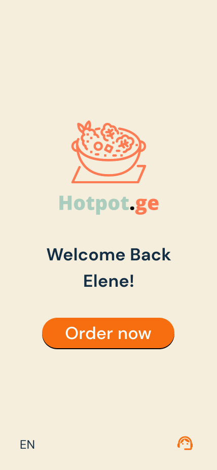
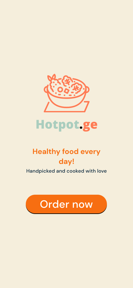
Since the main user is senior citizen and the personas showed tendency that they always need someone’s help to put an order, I decided to make the app as interactive as possible, so that the user has feeling that the design helps them via intuitive questions and cues.
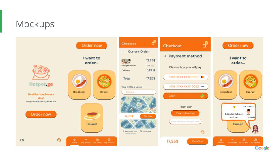
For the dedicated app we tried to solely focus on the ordering flow and it’s simplicity.

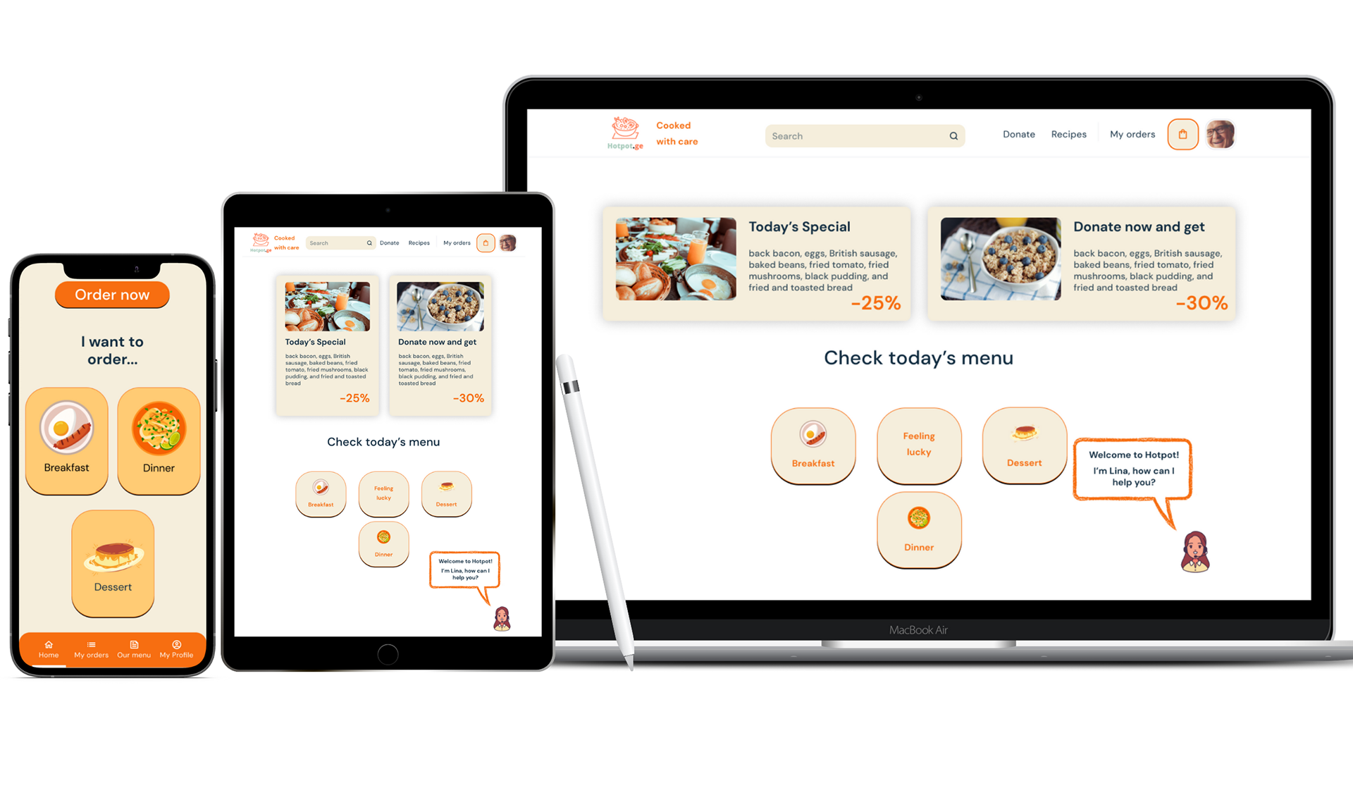
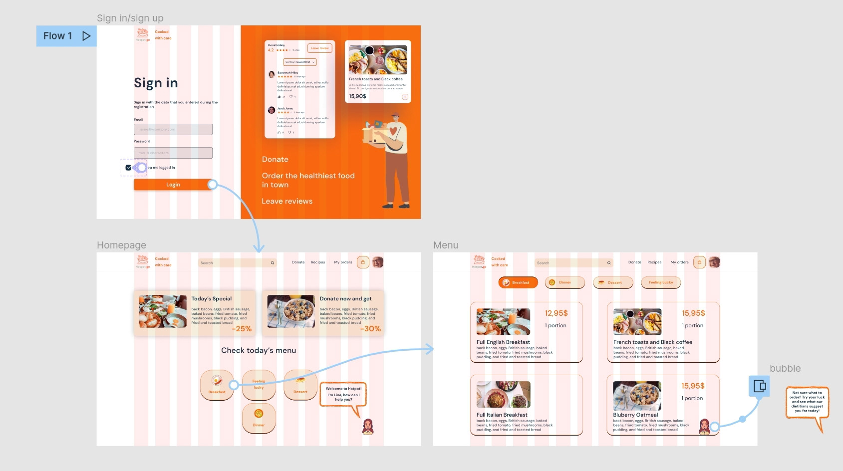
homepage is simple, only the most important content is placed.
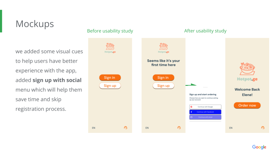
I've conducted unmoderated usability study once I was done with the digital wireframes to find out that:
1. Users want simple straightforward user flow
2. Some users preferred to have visual cues to help them finish the task.
3. Users prefer to know the identity of the courier as well.
Refining the design
We decided to consider minor groups (non native speakers, people with hearing problems and etc.) on the homepage.
Accessibility considerations
intuitive cues and clear labels for interactive elements, recipes and ingredients can be read by screen readers.
the simplified user flow with the help of on screen personal assistant feature.
Responsive design

We decided to while keeping the original focus on ordering food, making website even more focus on social good, so we added Donation option within website.
the designs for screen size variation included, mobile, tablet, and desktop. We optimized the designs to fit the specific user needs of each device while maintain the consistency.

Takeaways
Impact
Users seem to have positive thoughts about ordering food by themselves without asking for someone else's help or constantly struggle through design.
“When i first saw it, I won’t lie, I was very skeptical, because of my lack of trust in these apps, but the experience was fun, I could read even without my glasses, I liked the order tracking option and assistant on screen, it felt like design was speaking to me."
What I learned
The importance of simple yet effective designs. Even though the overall problem of NBU and lack of education in technologies in seniors are huge deal, I think I made my first step and it’s already an achievement for me.
Next Steps
1. Iterate more on designs, conduct another research on how successful the order flow is, if there is anything to be done.
2. On website add more details and explain more about customized healthy weekly plans
3. Educate more seniors about healthy lifestyle through app and website using suggestions throughout the ordering experience