Imagine, you're planning to visit a country you know nothing about and you can't seem to find a tour operator website that introduces you to the country. Yeah, it might be annoying. Now, imagine this scenario, there are so many websites and so much content that it gets overwhelming and you give up. So, what do we do?
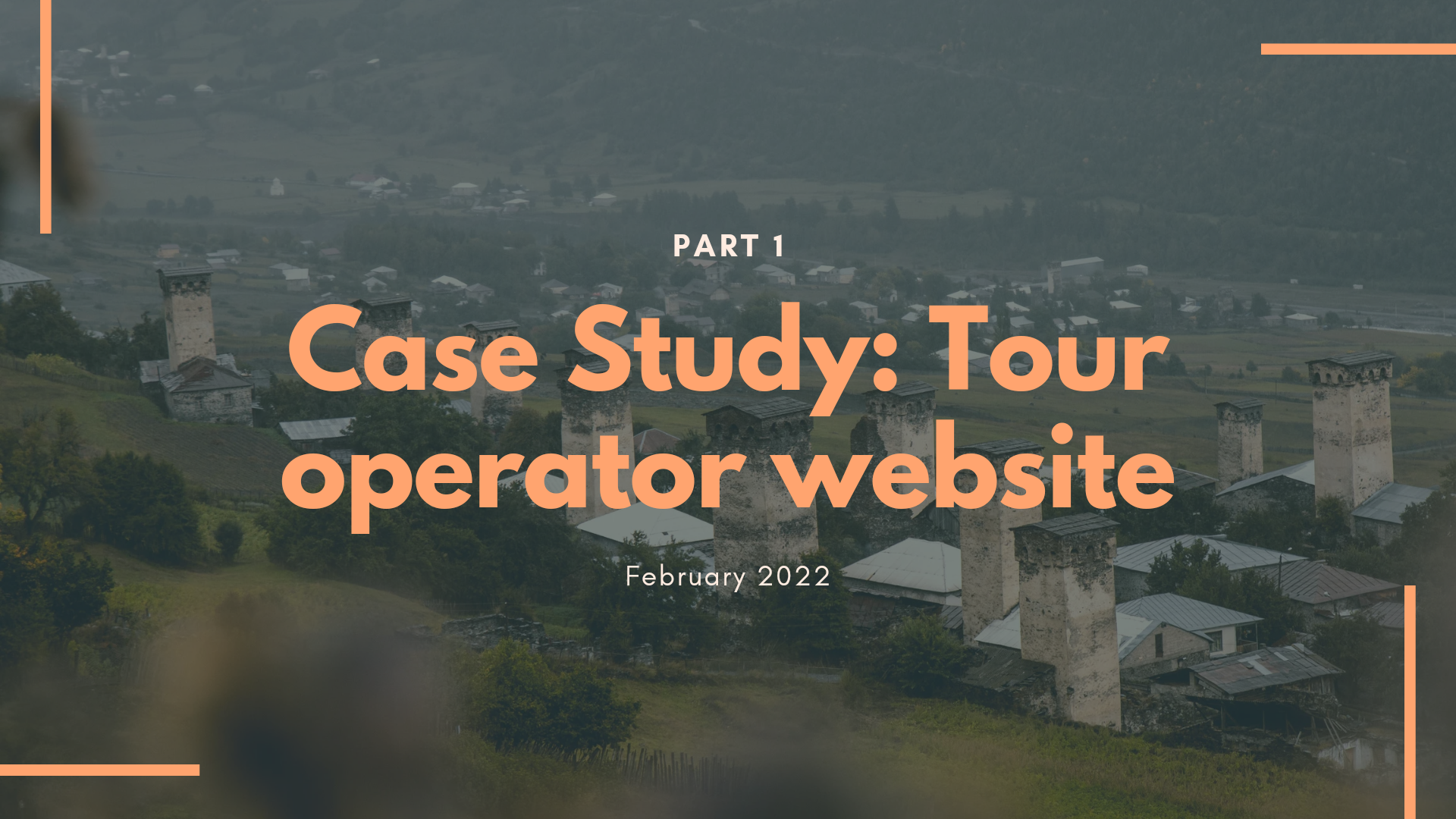
Case Study: Tour operator website
Project Background
For years, tourism has been a major source of income for Georgia. What makes the country fascinating is that you can enjoy different landscapes at the same time; climb mountains in Svaneti and enjoy sunset and the sea on Batumi coast on the same day. This diversity makes Georgia a desired destination to spend your holidays. According to Agenda.ge, Georgia has hosted over nine million international travelers in 2019. Over 3 billion USD was generated from the tourism sector, right before Covid19 hit.
Even though it's still early to state for sure, locals believe that 2022 will be an even better year for tourism than 2019 was. So far, it seems to be true. In January the number already surpassed 190 000 making a 38% percent increase compared to the same month in 2019.
Now, for a small country like Georgia, these numbers are quite impressive, but we can't really say the same about the local tour operator websites.
The Problem
GeorgiCa Travel is a local tour operator, with over 25 years in business, which offers a wide range of private and tailor-made tours in Georgia as well as combination tours of Georgia, Armenia and Azerbaijan for groups and individual travelers. Knowing that traveling business and tour service is a competitive field in the country, they are ready to break the tradition of raising awareness of their brand and Georgia by spreading the word only, in favor of improved user experience for their existing, new or target users.
The Goal
My role
Responsibilities
Project Duration
end-to-end responsive website representing their brand and the country for their target users.
UX designer, leading the design from conception to delivery
Solo project, conducting interviews, paper and digital wire-framing, low and high fidelity prototype, conducting usability studies, accounting for accessibility, iterating on designs, determining information architecture and responsive design.
Project duration: February 2022
Understanding the user
Main Challenge
This is not a funded project, I started working on it to expand my portfolio as a UX designer. Lately, I've become more interested in local tourism and how it affects the economy. The question I constantly ask myself is:
"Are tourists satisfied with the local tour operators?"
"Do they meet the requirements?"
"How do they feel when they leave the country?"
So my goal was to:
Design a responsive website for one of the oldest local brands that's easy, engaging and enjoyable to use.
Design trustworthy "all-in-one" landing pages to help raise awareness about the country through the company's ideas, views with their new, fresh design.
As I've already mentioned, even though the country is very small, there are tons of tour operators, hence, a lot of competitors, so it was important to make a long lasting positive impression through simple, yet engaging and informative architecture. Spending some time on their current website, I decided to stick with three main research methods. competitive audit, creating personas and user journey maps.
Research
Key findings
I've decided to include four direct and two indirect key competitors in my audit. Researching about their strengths and weaknesses I can say that:
1. Most of the competitors don't seem to elaborate about their brand identity, not many of them offer strong brand image + lack of visual information (like images, video etc).
2. Most of the competitors don't offer fast/direct communication with the company representative, while some of them use FAQ pages, but they don't really offer any comprehensive solutions.
3. Another thing was how transparent their guides' profiles were. While some of them were more or less transparent, not many of them offered even a brief info about them on the website. As a tourist, who's trying to hire a tour operator, nothing is more important to know that you're in professionals' hands.
I've asked my participants (6 participants, age between 18-70) to check and navigate the current website. My goal was to see the problems from different sides so that I would start working on a design solution.
Desire for improved site architecture, most importantly the navigation bar.
"Guides" page which isn't responding.
Accessibility
Lack of FAQ or inefficient communication on the website.
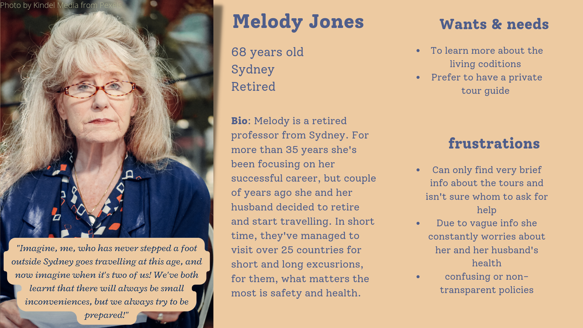
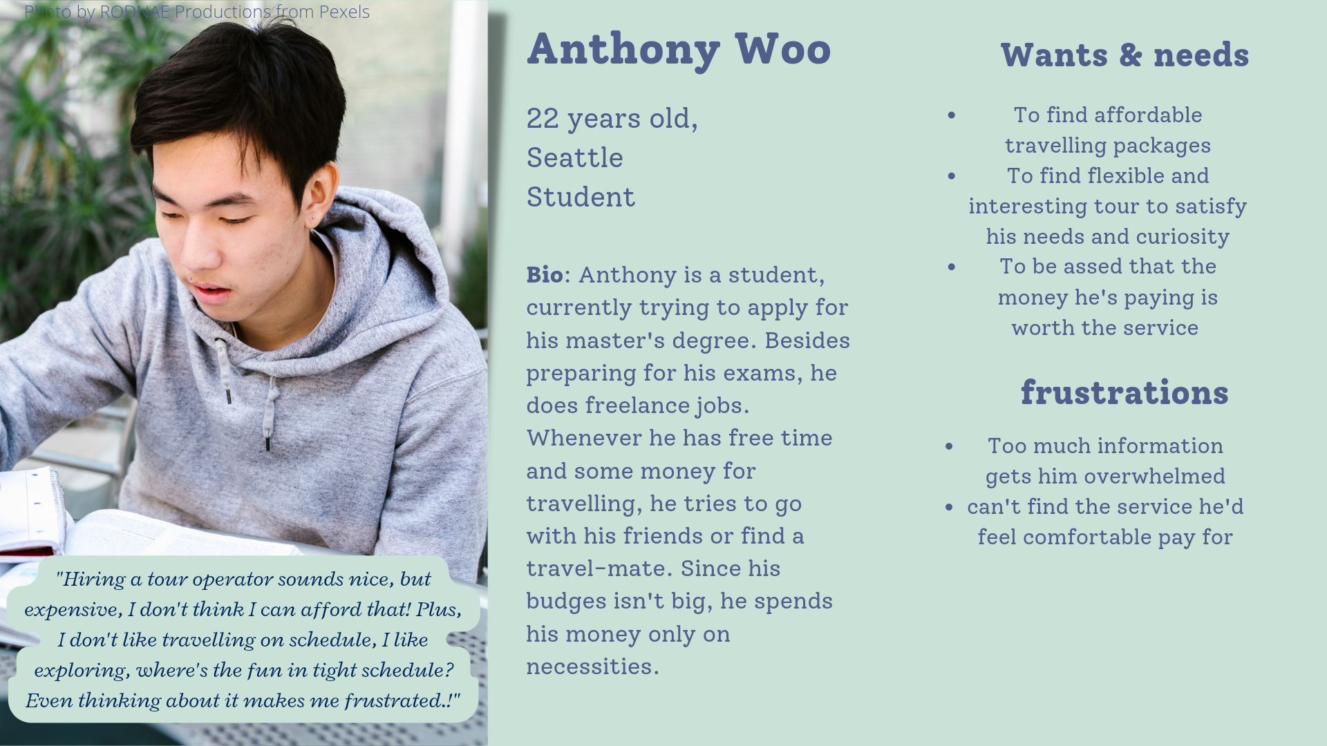
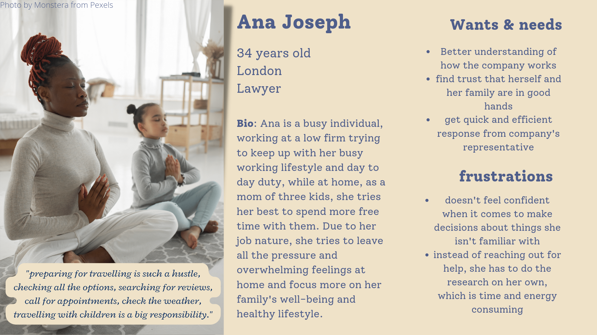
Personas
Solution
Making travel planning as fun and interesting as the traveling itself
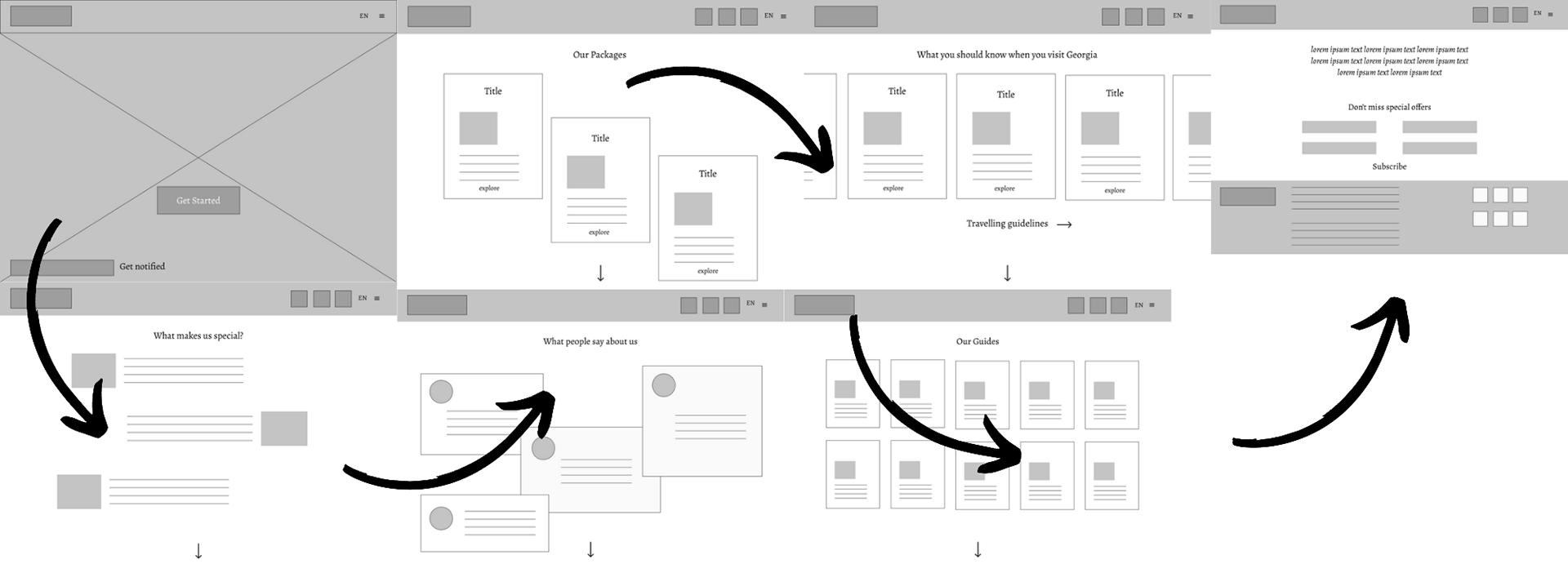
It's no news that one of the most important things when it comes to building a good partnership between the business and the client is presenting a clear and intuitive IA. I've asked participants to name the websites they felt the most confident when completing any task with. Based on that I decided to come up with IA which would be more user centered and wouldn't create an informative clutter on the website.
Design Process
I wanted for the design to be more user focused, while trying to maintain the brand's identity in a fresh more approachable way.
When it came to choosing the website homepage layout, I had a couple of ideas in mind, but in the end I decided to stick with the Full-screen Image layout, in this case the focal point would have been the scenery and sightseeing. Since the users would like to read the content quickly, I decided to mix it with the Zig-zag layout, which has to be the proven way to quickly absorb the important information. For the rest of the pages, I used the Asymmetrical layout.
Once I had a clear vision of what I wanted to achieve with the homepage, I decided to start working on the color palette and built a UI kit. Since I don't consider myself as particularly skilled in UI, it was definitely more time consuming to choose typography and create a consistent style guide.
For the logo and headlines I chose the Oranienbaum font, designed by Jovanny Lemonad in 2014. It is a modern font yet represents early 20th century pronounced Serifs family - has contrasting geometry, sharp angles yet wavy lines making it suitable for headlines and logos. I haven't thought much about its pairing, so to make a smooth balance with the Serif family font, I decided to pair it with Sans serif. Besides, since I already knew that I was going in favor of improving readability, I had to choose a font which would be familiar for users. I went for a clean, minimalistic Roboto family. It's been more than 10 years already since it was first introduced. According to Google Font Analytics, Roboto is one of the most popular fonts. Just like Alegreya + Lato pairing, I wanted something to compliment each other and to be well balanced at the same time.
Regarding the color palette, I knew only one thing for sure, I had to leave red as one of the main colors. Since red is considered to be their brand color and has been associated with the country. But still, I was struggling to see red as the main color of the homepage. I wanted to create a palette which would not only represent the brand but the diversity of the country, for example, including earthy tones. I am still considering creating separate palettes for different pages. When I started creating the first mockups, I didn't really have a whole palette. One thing I've learnt is that it's better to leave a little space for iteration when it comes to creating style guides and UI kits.

Coming up
Part 2: Hi-fi mockups of the landing page
Part 3: Working prototype, usability study results.