

Whenever I think back to my visits to my aunts’ place outside the city during the New Year, this one memory always pops up. It’s usually the second or third day of the new year, and I’m getting ready to head back home. My aunt always insists on packing some home-cooked meals for me and my cousin. I usually don’t want more stuff in my luggage, feeling anxious about the additional load, but my aunts are up early in the morning, diligently packing and repacking food and treats into a really small bag. They somehow manage to squeeze what looks like a week’s worth of meals into that tiny space.
If you’re a perfectionist like my aunts, this might not seem all that unusual. But now, as an adult, when I think about it, I realize they were like us, designers without even knowing it. I’ve always been fascinated by the concept of packing, or fitting stuff into places where it doesn’t seem to fit unless it’s well thought out. From playing Tetris to packing your own luggage, there’s this sense of happiness you get when all the pieces are in the right places and everything just looks right.
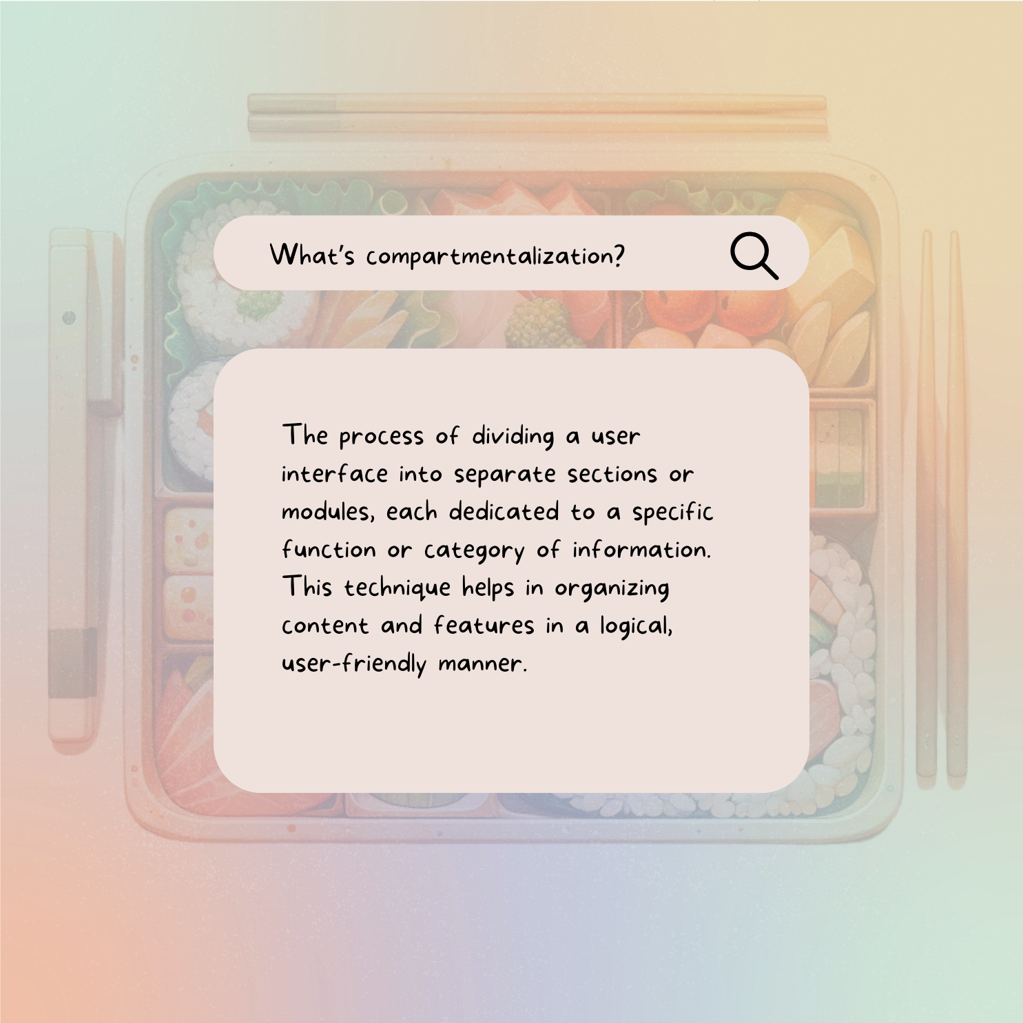
This fascination with packing isn’t just about getting things into a bag; it’s about organizing them in a way that makes sense, where every item has its place and purpose. This, in a lot of ways, mirrors the principles of compartmentalization in UI design.
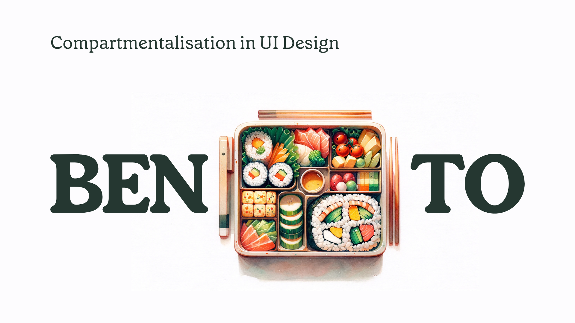
Compartmentalization: More Than Just Packing
In UI, compartmentalization is about more than just fitting things into a designated space; it’s about making sure that each element is accessible, usable, and serves a clear purpose. Just like how my aunts carefully chose which dish went into which compartment of the bag, ensuring that the flavors wouldn’t mix and that the more delicate items wouldn’t get crushed, a UX/UI designer arranges the elements of a website or app to optimize user interaction.
User Interface is Like a Well-Packed Bag
Think of a well-designed app or website as a perfectly packed bag. When you open it, you instantly know where everything is. You can find what you need without rummaging around. Everything feels intuitive, like it’s in its natural place. That’s the essence of good compartmentalization in UI design — it’s about creating a user experience that feels intuitive and effortless.
Bento Design in UI: Aesthetic Meets Function
The Bento design style, in web and user experience/interface design, refers to a card-based design or grid layouts, where information is presented in distinct sections or containers for clarity and ease of use. This structuring approach that is inspired by the concept of a Japanese Bento box. A Bento box is a single-portion box containing a variety of different dishes, each in its own compartment, making for a balanced and visually appealing meal. Similarly, in Bento design style for websites or applications, content and features are compartmentalized into distinct sections or “compartments.” This style emphasizes organization, clarity, and aesthetic appeal.
What makes the Bento Design Style so effective in UI is its ability to offer visual clarity and organizational elegance. Each compartment, like the sections of a bento box, is clearly defined and separate from the others. This separation ensures that the user isn’t overwhelmed by information or choices. Instead, they are presented with a clear, organized interface where finding what they need is intuitive and straightforward.
Enhancing User Experience with Intuitive Layouts: Why Bento grids?
Imagine opening an app and being greeted by a cluttered, disorganized interface. It’s like opening a lunchbox to find all your food mixed up. The Bento Design Style in UI is the antithesis of this. It’s about creating intuitive layouts where users can easily navigate and find what they’re looking for. Each compartment in the UI is like a different dish in the bento box, uniquely flavored but part of a cohesive whole.
If I had to characterize key moments in these types of layouts, I’d say Bento design’s key characteristics are:
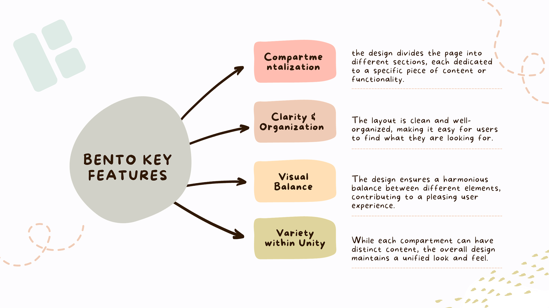
Key Characteristics of Bento Design Style:
Compartmentalization: Just like a Bento box, the design divides the page into different sections, each dedicated to a specific piece of content or functionality.
Clarity and Organization: The layout is clean and well-organized, making it easy for users to find what they are looking for.
Visual Balance: The design ensures a harmonious balance between different elements, contributing to a pleasing user experience.
Variety within Unity: While each compartment can have distinct content, the overall design maintains a unified look and feel.
I don’t want to speak only about the best part of this style, every design layout has its Pros and Cons:
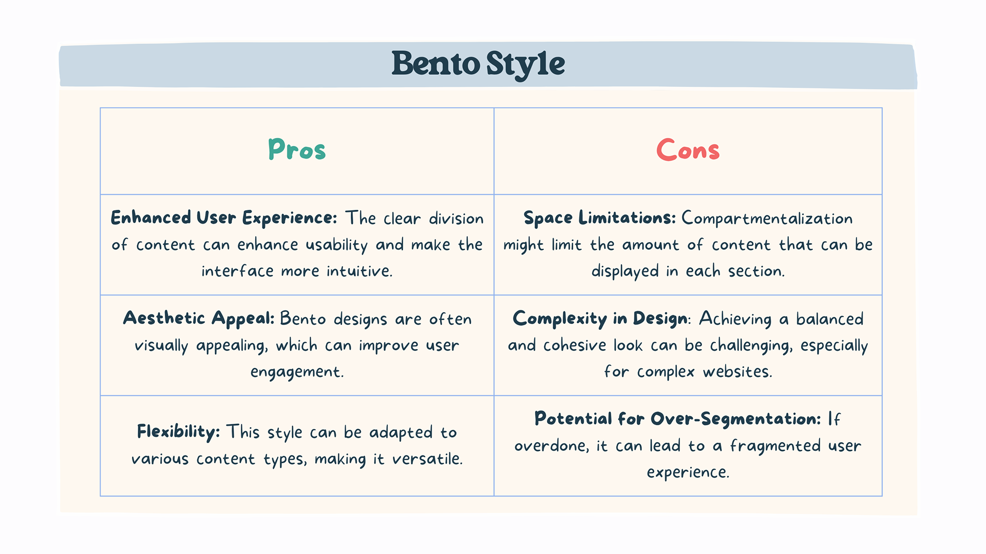
Pros:
Enhanced User Experience: The clear division of content can enhance usability and make the interface more intuitive.
Aesthetic Appeal: Bento designs are often visually appealing, which can improve user engagement.
Flexibility: This style can be adapted to various content types, making it versatile.
Cons:
Space Limitations: Compartmentalization might limit the amount of content that can be displayed in each section.
Complexity in Design: Achieving a balanced and cohesive look can be challenging, especially for complex websites.
Potential for Over-Segmentation: If overdone, it can lead to a fragmented user experience.
Conclusion
Reflecting on those New Year visits to my aunts, I realize now that their skill in packing a small bag with a week’s worth of meals was more than just an act of love; it was a lesson in efficiency and precision. The Bento Design Style in UI, much like their meticulous packing, taught me that there’s a place for everything, even in the smallest of spaces.
This style isn’t just about fitting things together; it’s about creating a space where every element, no matter how small, has its purpose and place. It’s a reminder that in design, as in life, simplicity and order can bring not only beauty but also the functionality.