
Coinit simplifies finance management through seamless transactions, intuitive budgeting tools, and investment insights. It empowers users to manage expenses, grow their savings, and navigate financial planning.
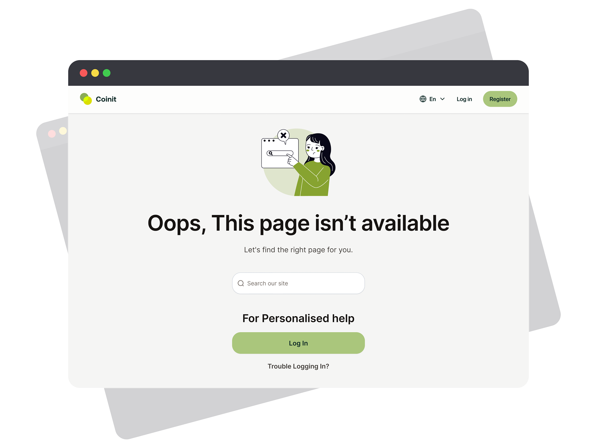
Wise's error page is renowned for its intuitive and helpful design. We wanted to achieve something similar for our designs, create something that would not only reflect our brand's professional image in the finance field but also resonate with users by being accessible and supportive.
We chose a clean and minimalist design to exude the sophistication and orderliness crucial in the finance sector. The color scheme and typography reflect Coinit's brand identity, which is intended to be instantly recognizable to our users, fostering trust and brand cohesion. Understanding that encountering a 404 error can be disorienting, we crafted an error message that is clear and non-technical: "Oops, This page isn't available." It’s intended to reassure users in a conversational tone, avoiding technical jargon that could add to their frustration.
We then placed a search bar centrally on the page, offering an immediate and straightforward way for users to navigate their own solution. This empowers our users to quickly find what they're looking for with minimal disruption to their experience.
Direct help options such as "Log In" and "Trouble Logging In?" are prominently placed. These are not only actionable but also suggest that personalized support is readily available, further enhancing the sense of user support and service reliability.
To make the page visually appealing and ensure easy scan-ability, we utilized a layout with plenty of white space and a simple but sympathetic character illustration. This not only captures the user's attention but also aims to alleviate any irritation associated with landing on a 404 page. The visual hierarchy is carefully planned, guiding the user's eye in a natural flow from the error message to the search bar, followed by personalized help links.
Lastly, the "Some Topics To Explore" section at the bottom offers a guided pathway back to the site's main content. The icons are intuitive, ensuring that users can quickly identify and navigate to key areas of our platform. This feature was designed to keep users engaged and reduce the chance of them leaving our site due to the error.